CREATIVE & ART DIRECTION | BRANDING & DESIGN
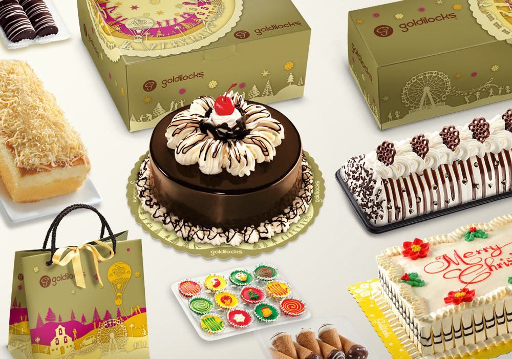
• Illustrated a series of holiday-themed artworks for the limited edition Christmas packaging of a popular bake shop
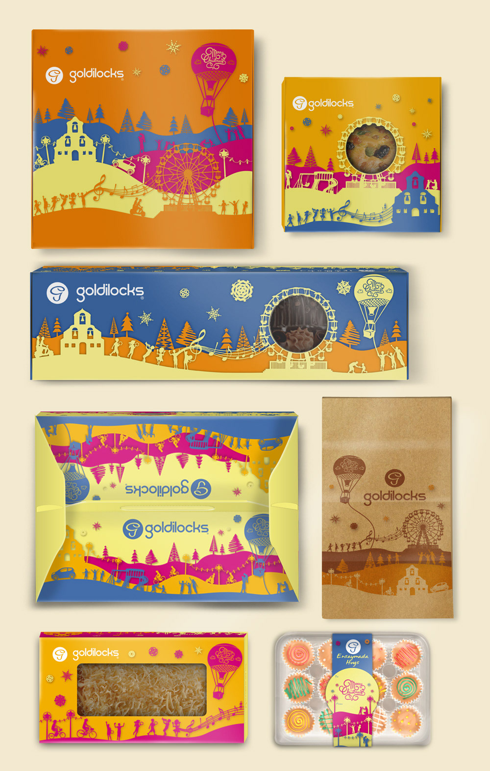
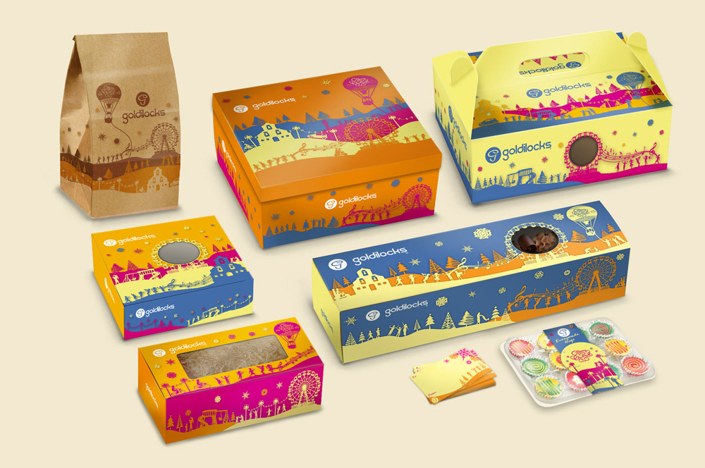
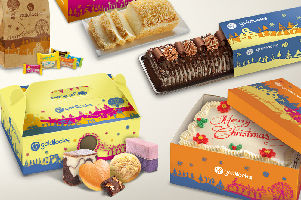
• Designed the limited edition packaging for all the premium and regular line of products for Goldilocks Bakeshop
• Adapted the illustration as style templates for use in print promotion materials that were used in the following year after the holidays
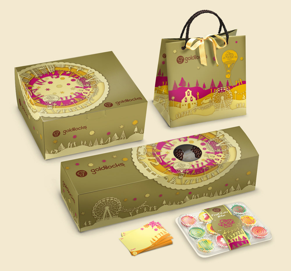
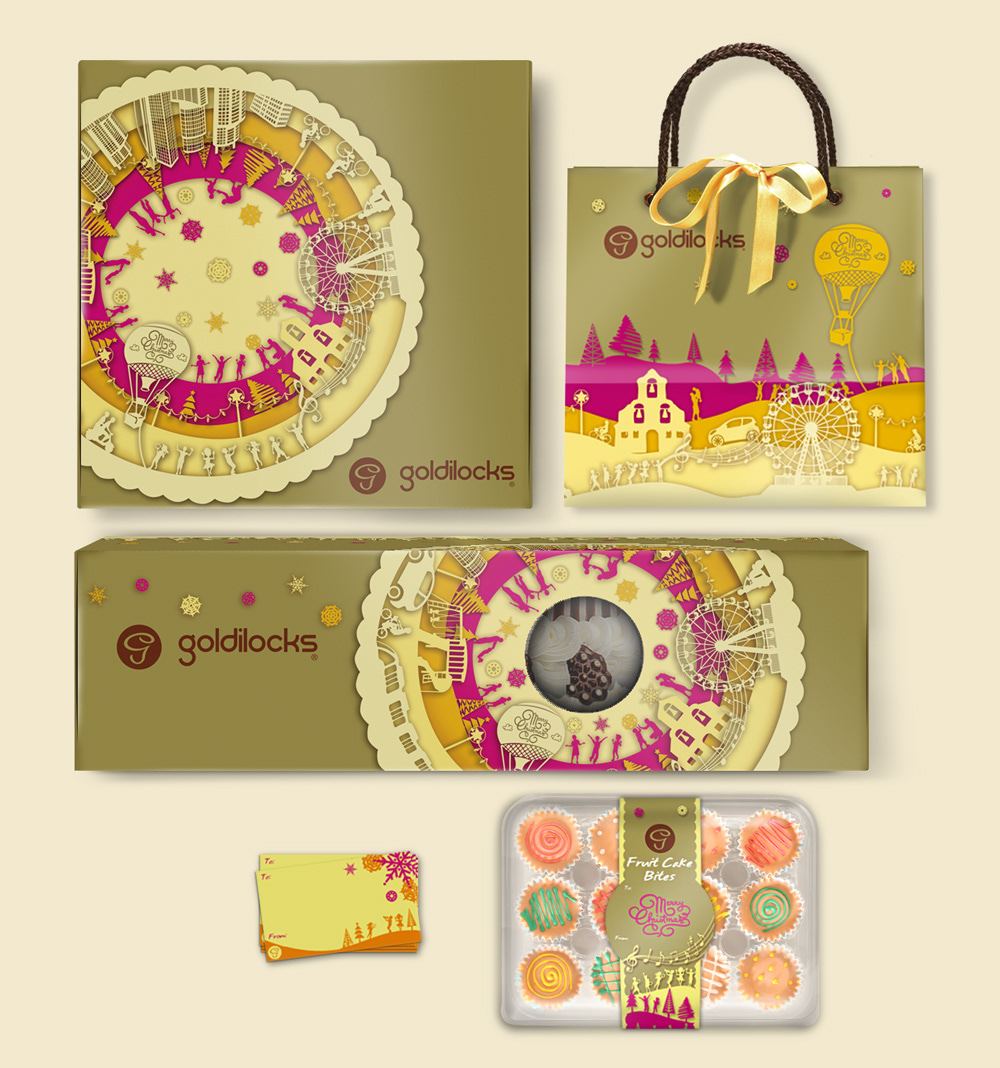
~ PREMIUM LINE ~
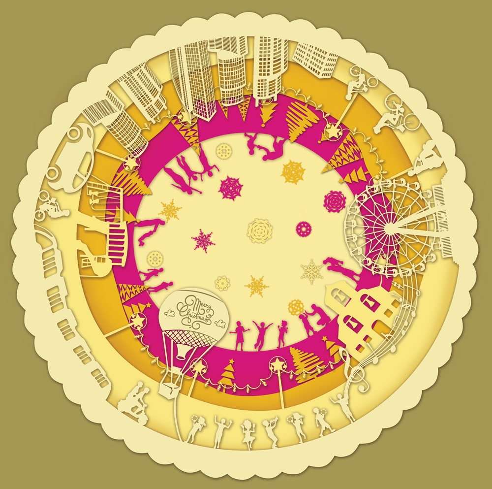
Packaging is done in muted tones of gold and cream with a bright pink accent.
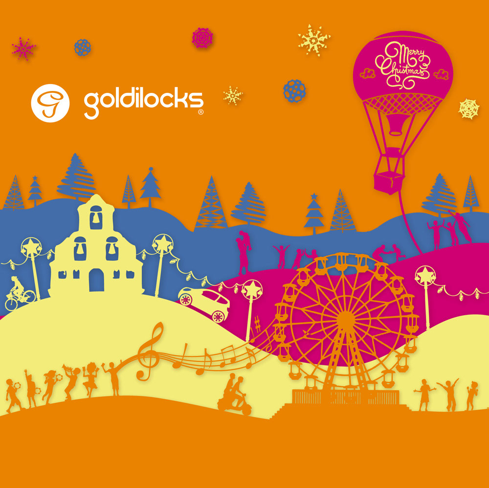
My task was to develop a holiday-themed packaging design for Goldilocks Bakeshop. Part of my task was to incorporate their signature Pantone colors in shades of gold, yellow, and brown and infuse it with a festive look that had touches of local and western Christmas elements. For the design to be adaptable, I worked with a paper cutout concept with solid colors forming layers of landscapes. This allowed the main round doily illustration to be adapted to horizontal and vertical landscape formats.
The success of the limited edition Christmas packaging led to the style treatment being used as a design template in the brand’s collaterals in the following year.


~ REGULAR LINE ~
Packaging is done in combinations of bright colors to convey a more playful air.