CREATIVE + ART DIRECTION | BRANDING + DESIGN | ILLUSTRATION
• Illustrated the packaging design for a new limited edition line of canned tuna products. Illustrations were deliberately created to be adaptable to multiple formats and easily extendible to additional flavor variants
• Art directed the food styling of each featured meal and styled the typography of each of the label designs
• Managed the project end-to-end from creation of the initial designs, management of the photo shoot, up to the release of the final designs for print
My role was to illustrate a packaging design that could easily be extended to more flavor variants as well as adapted to other formats. Part of my task was to craft the typography and art direct the food styling of the featured meal on each label. I handled the production of the labels end-to-end, from sketching out initial illustrations, to producing the print photo shoot up to managing the release of the final art materials for print.
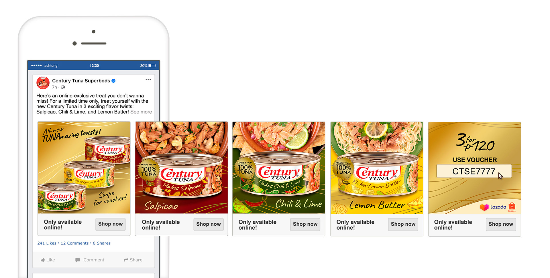
Aside from developing the packaging design, I was also tasked to develop the communication strategy together with the team and specifically, produce all the creative assets that will be used for the launch and sustaining events.
The special edition line of Century Tuna products were developed to introduced new, unique flavors in a market experiencing flavor fatigue. It launched in the brand’s main social media platforms, namely, Facebook, Youtube, and Instagram and was initially only available for purchase online in order to test the market. Within a month, the new line was made available to major grocery stores.
Below are the packaging designs developed for the first four variants and the creative assets used for the launch.
Social ads of the launch
Scroller Ad
