the
PREVIEW
-----
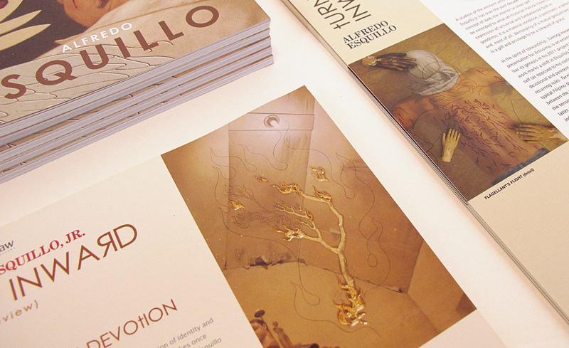
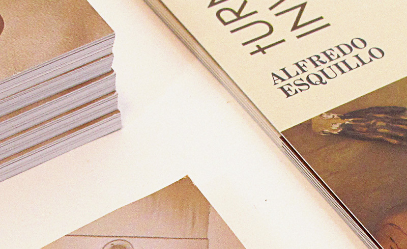
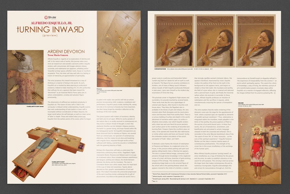
The gallery decided to hold a preview of the artworks in the Philippines before the start of the Artissima International Fair in Turin, Italy. A back-to-back presentor was created to accompany the preview. Design was kept deliberately clean and simple using a 3-column layout for easier reading to compliment the low-key preview.
the
PRESENTOR
PRESENTOR
-----
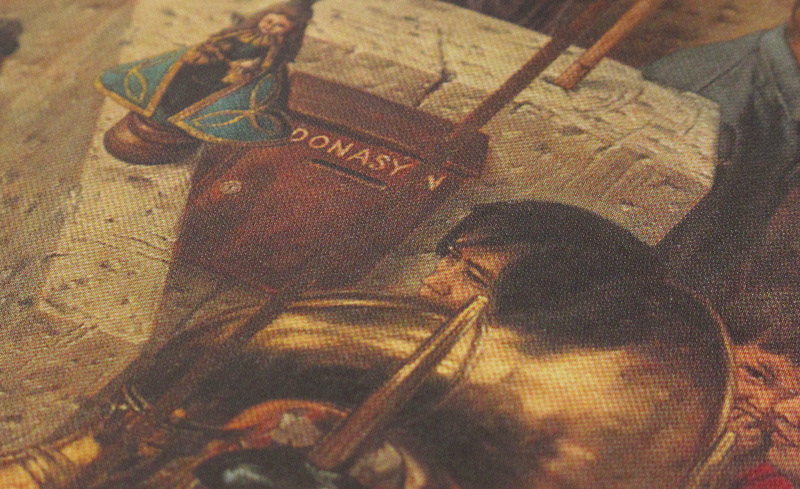
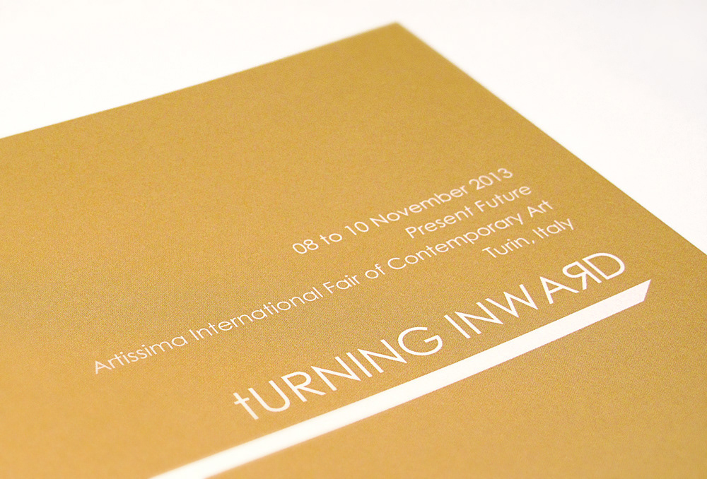
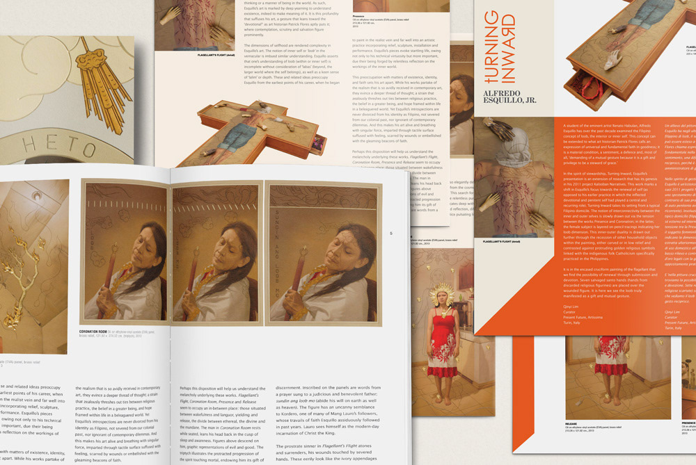
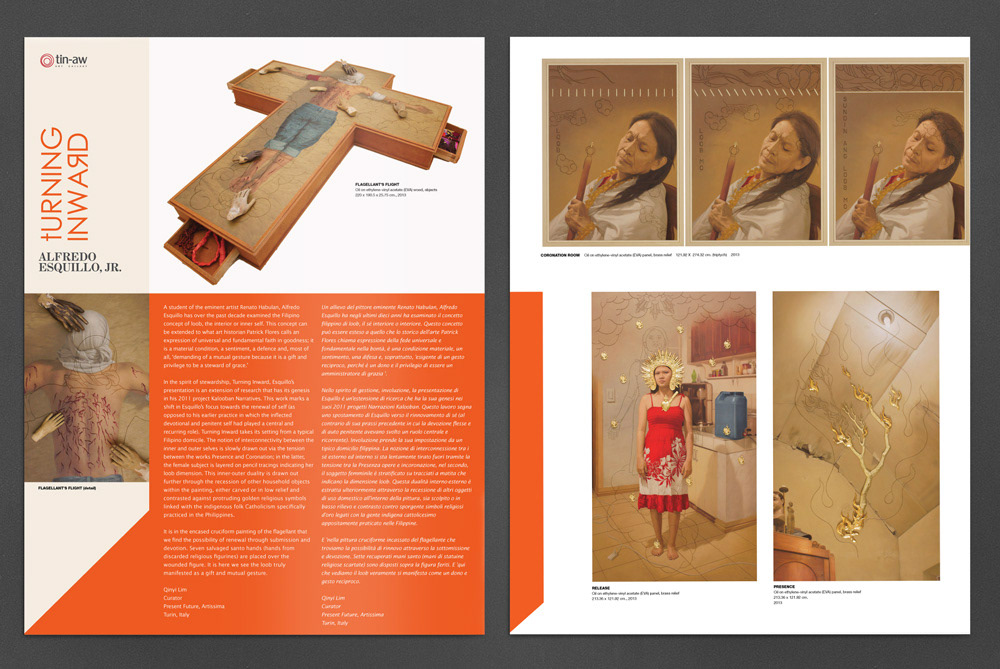
For the actual fair, the gallery wanted to have a presentor similar to the preview material with a more dynamic design. We needed to ensure that the graphic elements complimented and did not clash or overwhelm the artworks it intended to highlight. Originally, an orange color band was used to contain the copy but due to printing constraints the presentor eventually printed did without the color band and the body copy's font color was changed to a dark gray.
For the actual fair, the gallery wanted to have a presentor similar to the preview material with a more dynamic design. We needed to ensure that the graphic elements complimented and did not clash or overwhelm the artworks it intended to highlight. Originally, an orange color band was used to contain the copy but due to printing constraints the presentor eventually printed did without the color band and the body copy's font color was changed to a dark gray.
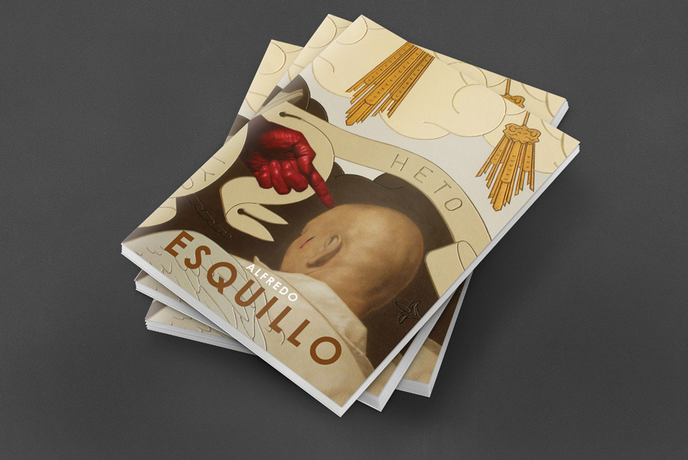
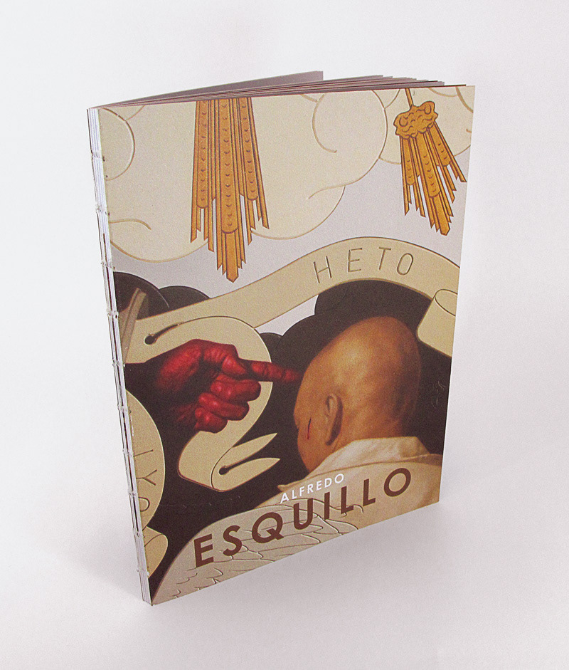
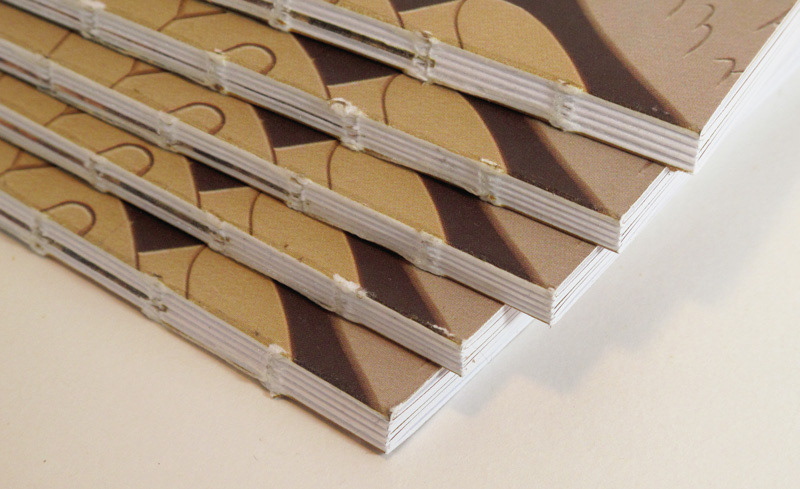
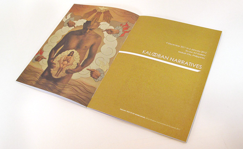
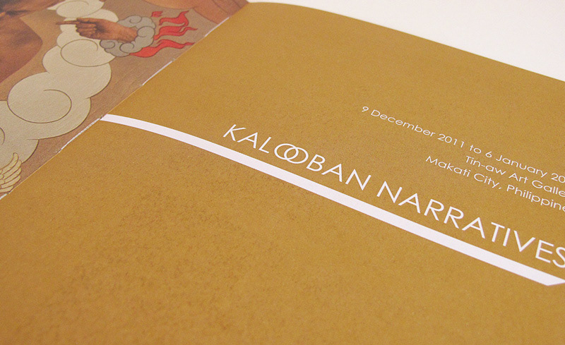
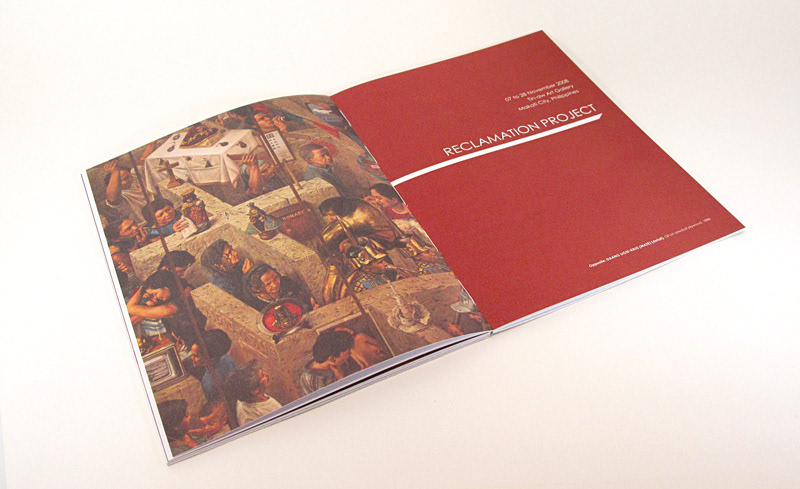
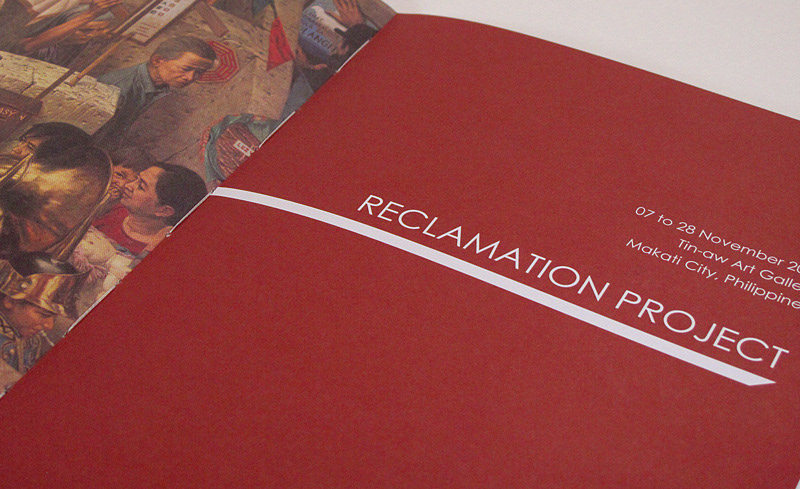
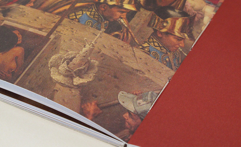
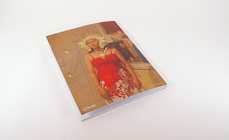
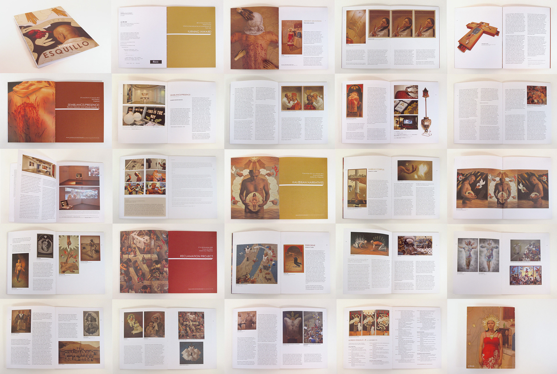
the
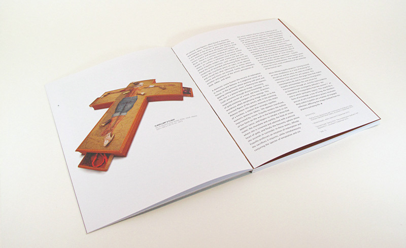
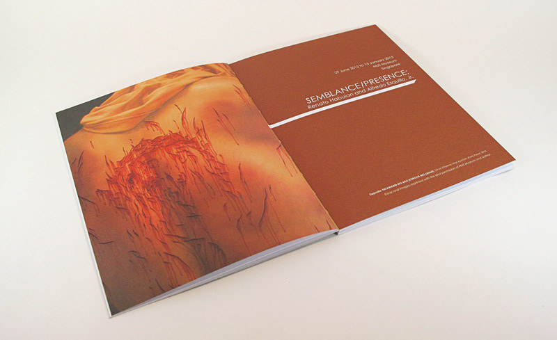
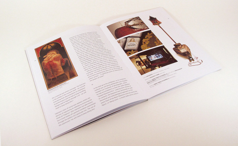
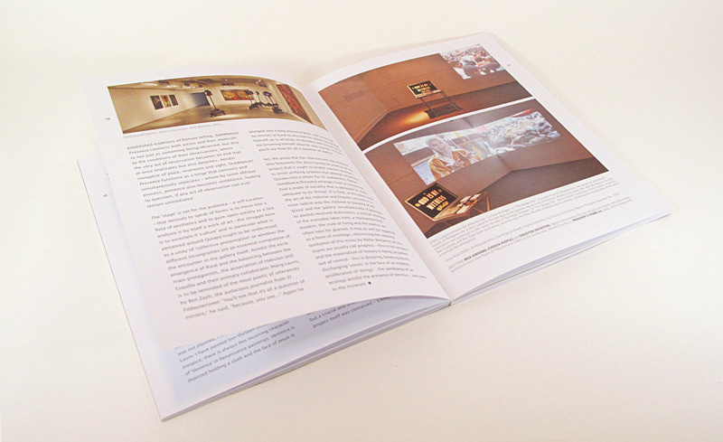
BOOKLET
-----