CREATIVE + ART DIRECTION | BRANDING + DESIGN
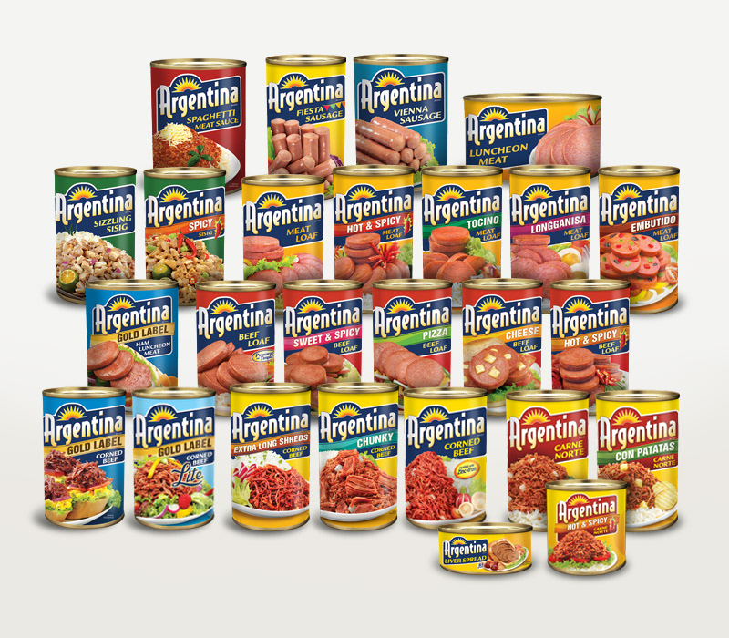
• Rebranded with a new logo for Argentina, a popular canned meat line
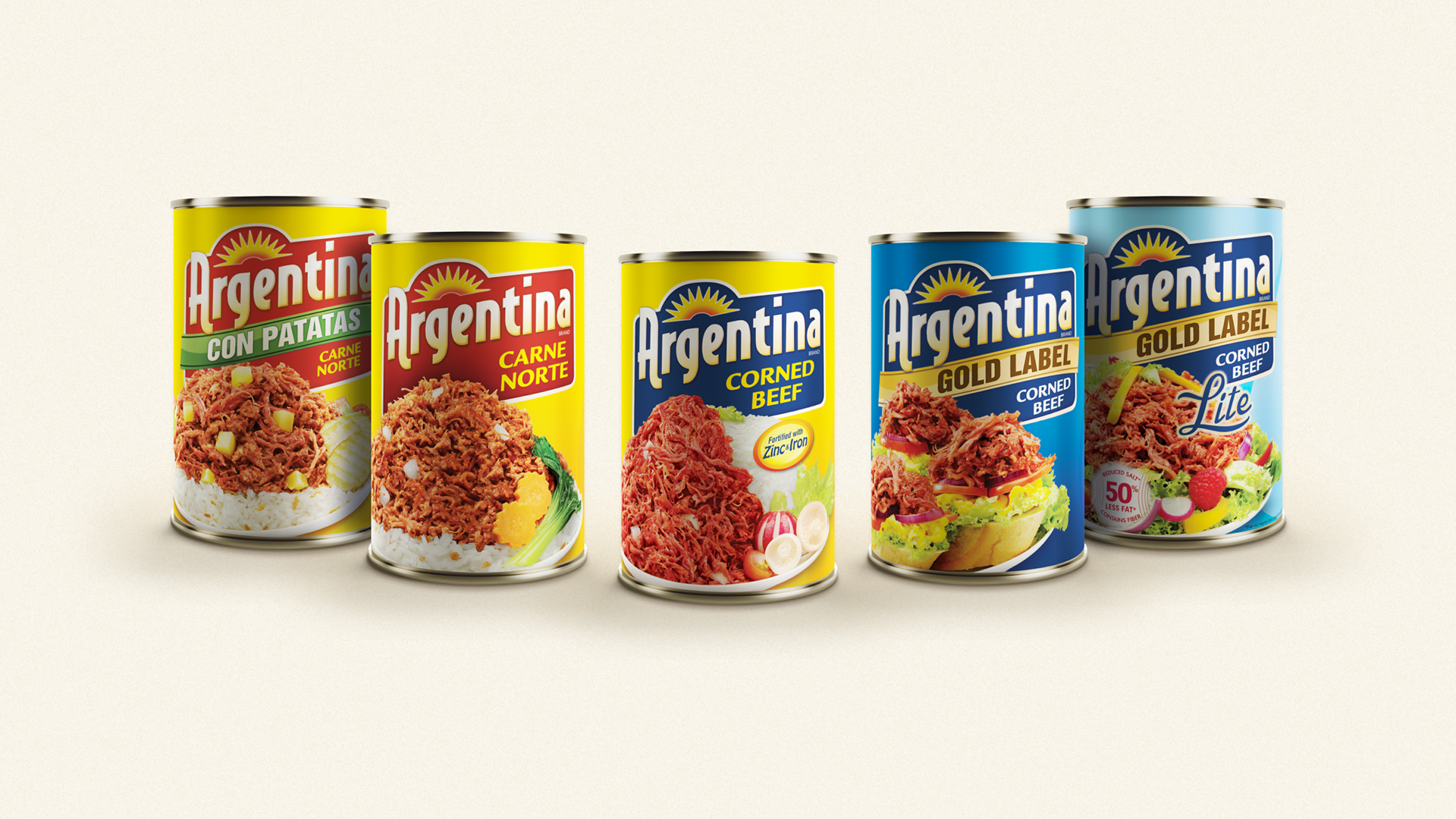
• Designed new packaging for the whole line of Argentina products
• Art directed the food styling of each featured meal in the brand’s line, managed the photoshoot of the featured meals, and coordinated with foreign print production suppliers for the export line
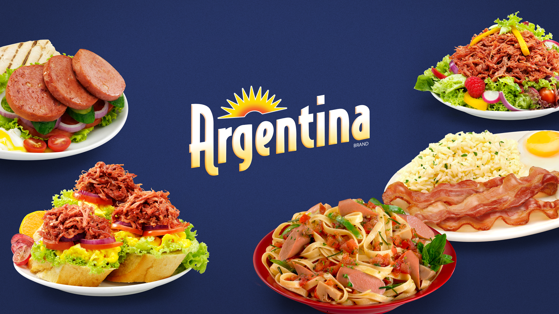
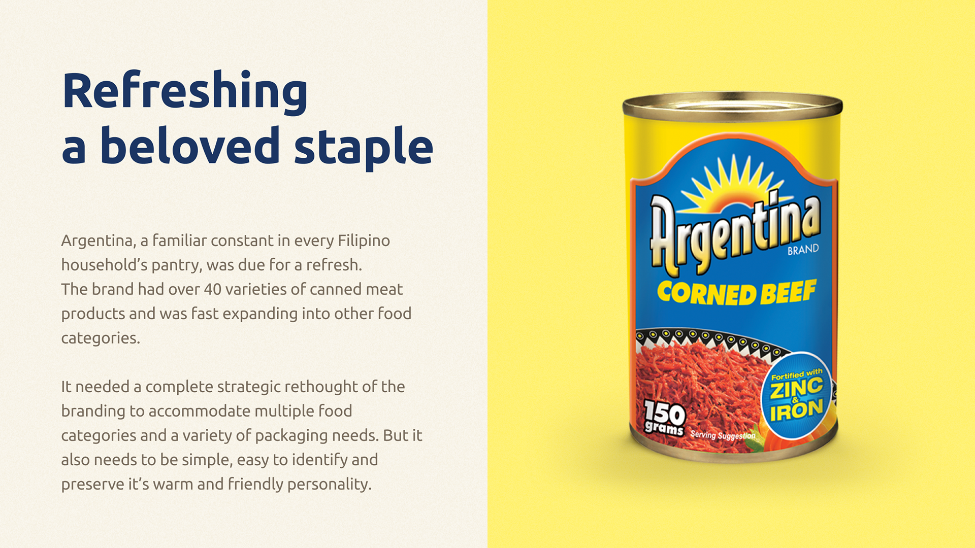
Argentina Meats is a popular line of canned meats in the Philippines. To arrest a declining trend in the market, it was decided to refresh the brand with a new logo and completely overhaul the packaging design of the entire line. My task was to create a new logo that breathed new life into the brand and make it look more relatable and friendlier to a younger market. I made a deliberate choice to highlight the meals featured for each variant, recommending to the client that by putting more emphasis on generous plating and colorful food styling of the meals the brand will hold more appetizing appeal to shoppers. Part of my task was to art direct the food styling of each variety and work hand-in-hand with the food stylist and photographer to get the best images for the packaging.
The success of the rebranding campaign garnered more packaging projects for our agency and eventually led to the entire account being awarded to us. To date, the brand has expanded to various other markets including North America, South America, Europe, and the Middle East. For the expansion, part of my task was to adapt the packaging design to export versions and new varieties exclusively available to certain foreign markets. I was also tasked to coordinate with the production team in these other markets to ensure translations were accurate and the adapted packaging designs abided with the local regulations.
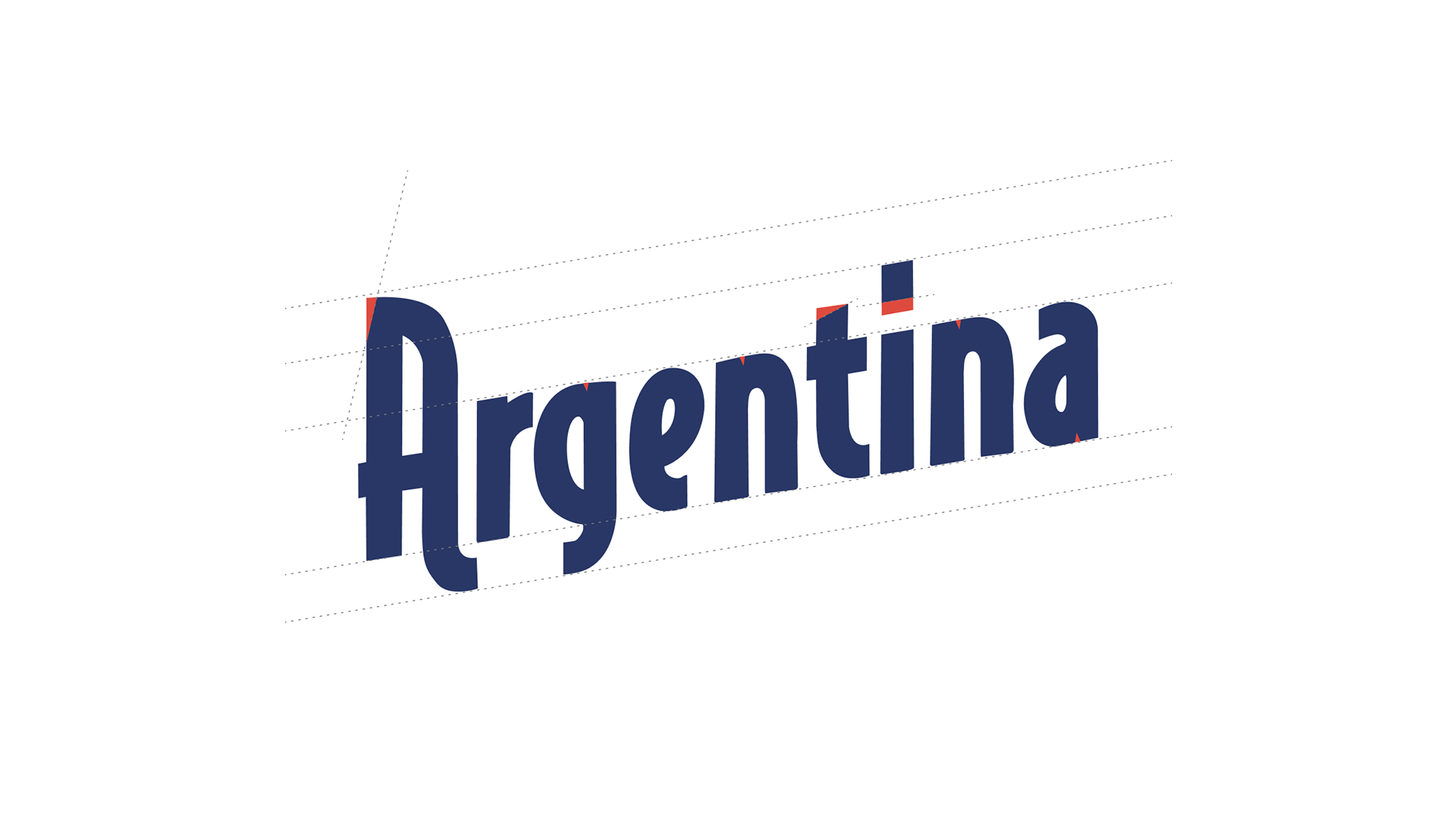
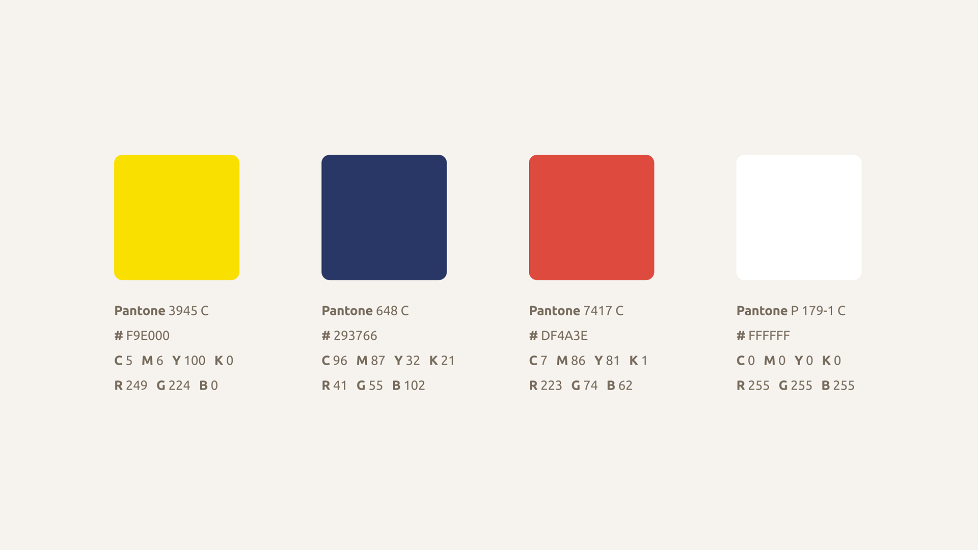
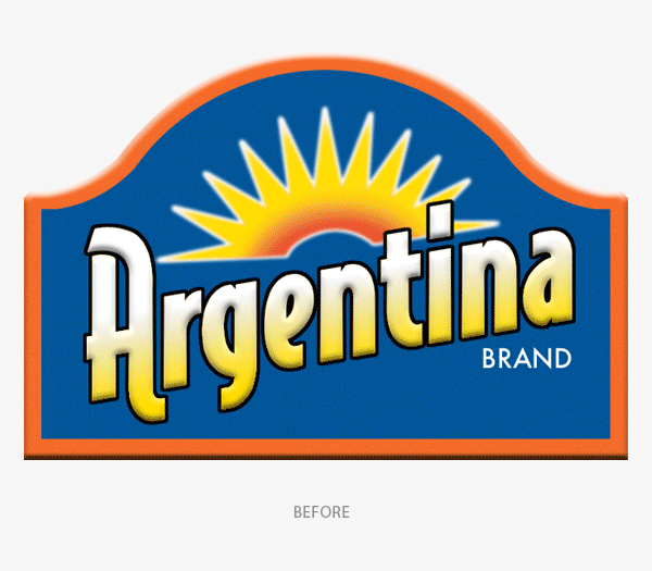
Elements of the original logo were kept to maintain brand recall with the existing market. The logotype was streamlined with the original black outline removed and the individual characters tweaked. A sharper bevel effect and smoother gradient further enhanced the look of the logo against the deeper blue of the new frame.
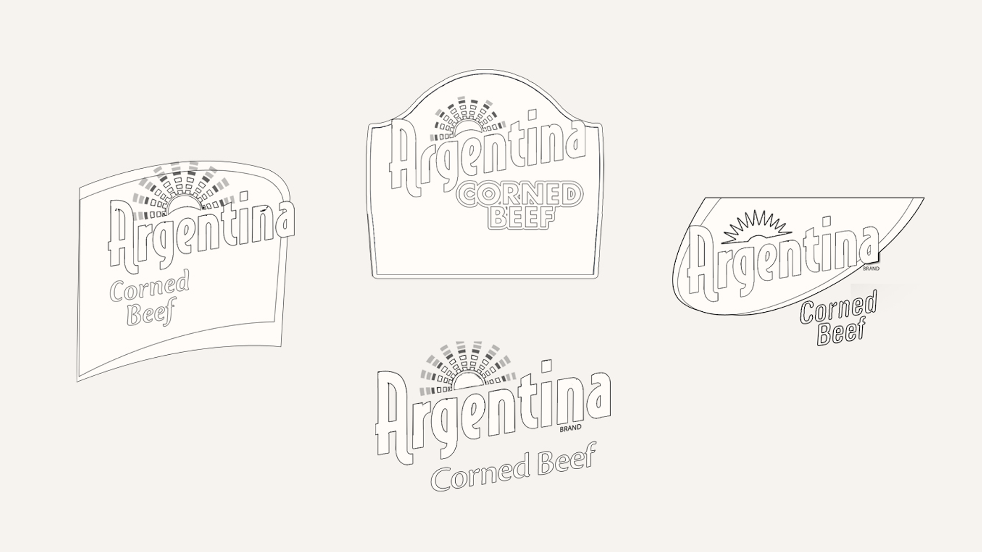
Originally a traditional spanish arch window, the new frame hugs the logotype and curves around the edges creating a more unified look with the bottom ledge of the frame meant to be extendable for label usage. The iconic sun graphic was slightly tweaked but generally retains the same look.
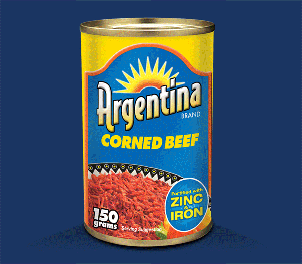
Flagship product of the brand: Argentina Corned Beef. The original label was updated with a new logo, a bolder color palette, with the food shot restyled and given more real estate space on the label creating an overall look that is fresher and more appetizing.