
I’m Trace, a designer building design<>code workflows and shipping products with AI

/PROJECTS

FIG. 01AI/WF
NAME
AI workflows
NOTES
Harnesses in Obsidian. Chains of .md skills. Agent workflows (essentially cron jobs) serving Discworld emojis and Futurama memes.

AI workflows

Harnesses in Obsidian. Chains of .md skills. Agent workflows (essentially cron jobs) serving Discworld emojis and Futurama memes.


/SELECTED WORK

One buying flow for 1,300+ pages: A clear way for schools to buy K-12 resources

  • EDUCATION
  • UX
  • WEB
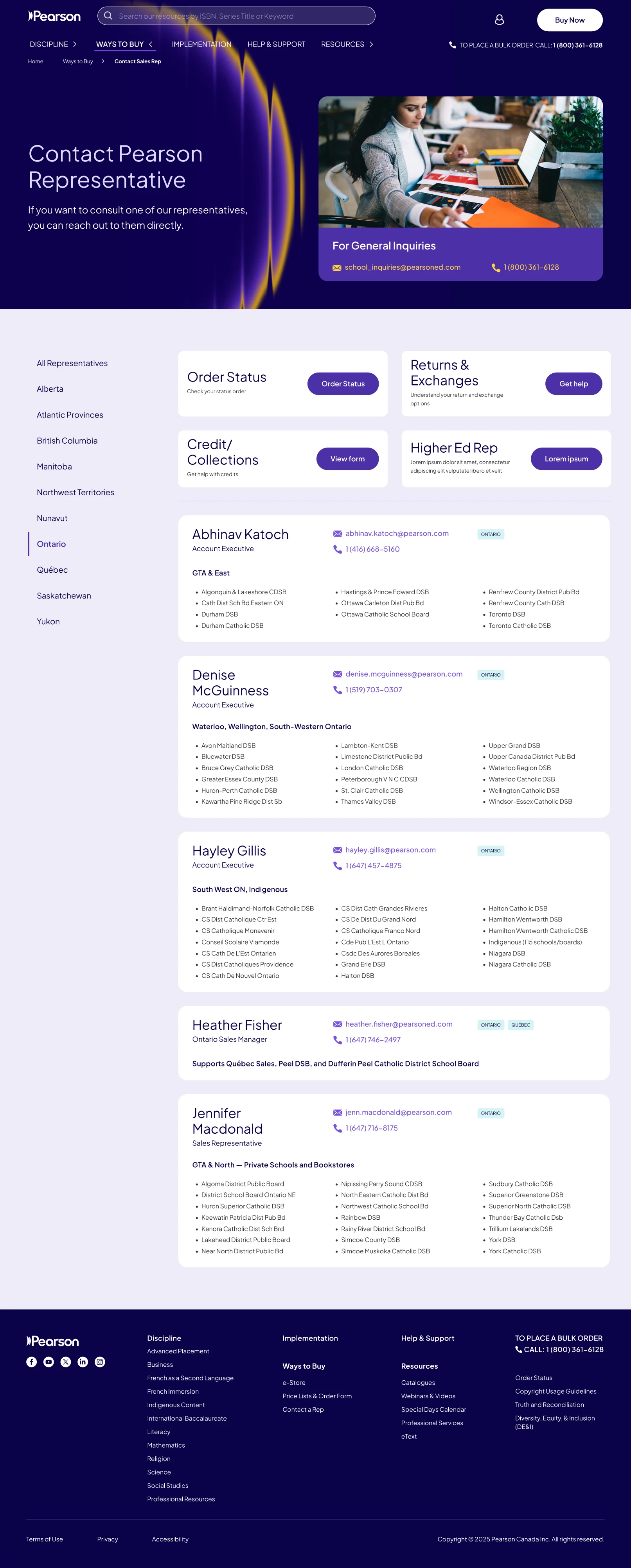
WAYS TO BUY
4
Clearer purchase journeys via the store, order forms, phone or a rep
ONE FLOW
Many → 1
The same multi-step program flow across all 12 disciplines
1 PEARSON
1 brand
The same experience across all Pearson touchpoints
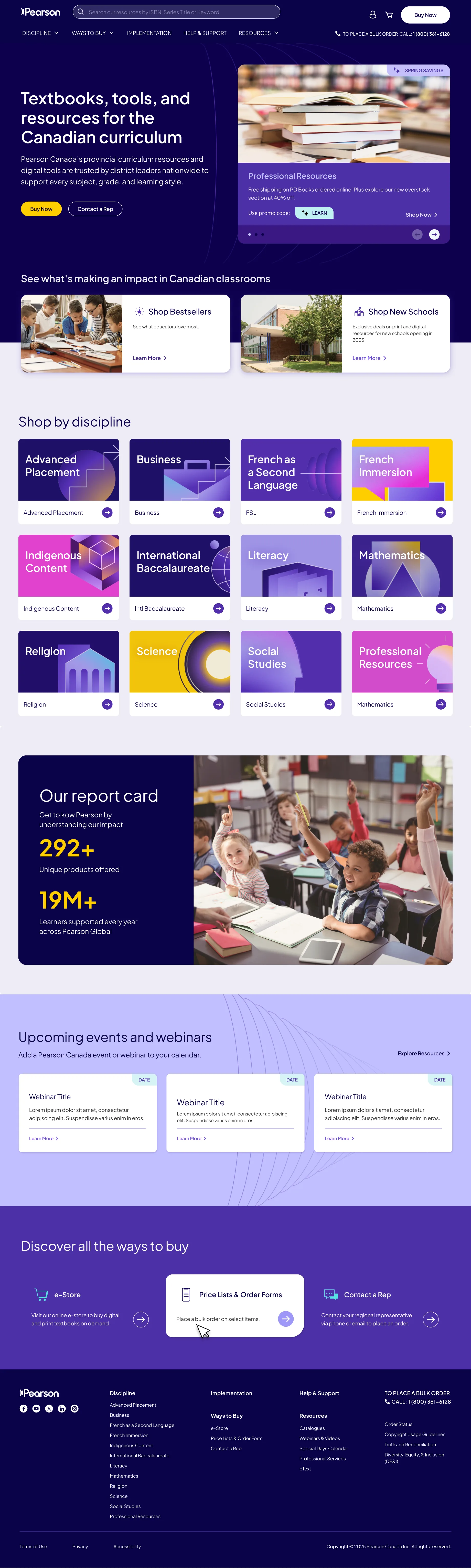
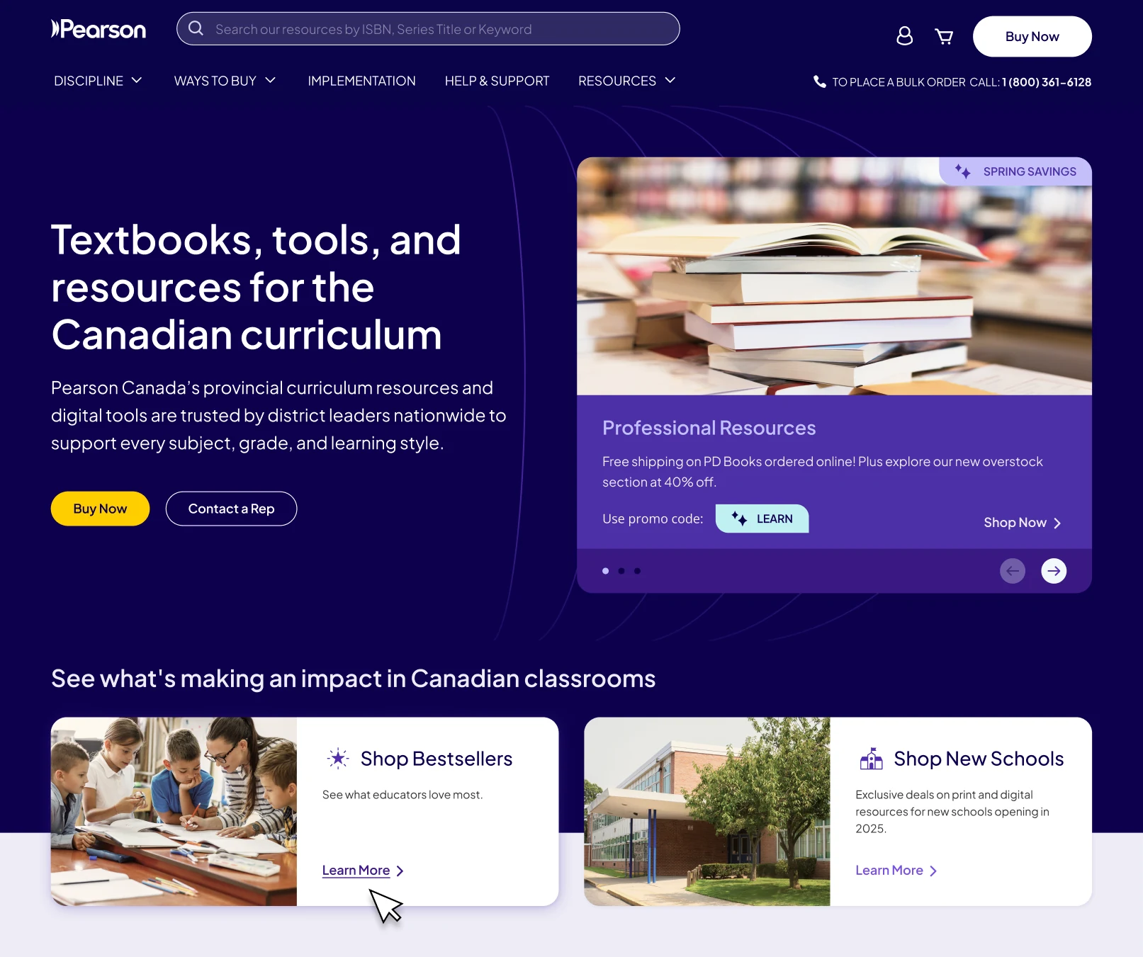
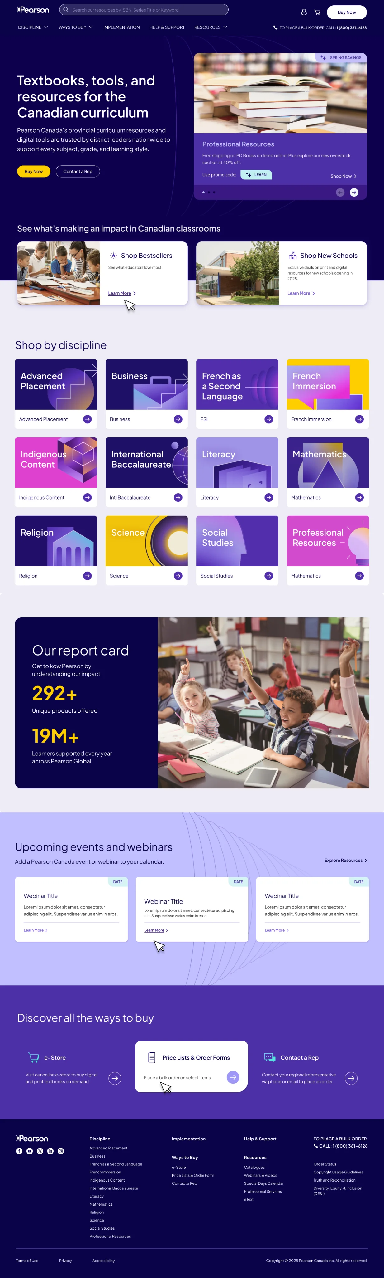
The new homepage with improved UX, CRO, and better information hierarchy

tl;dr

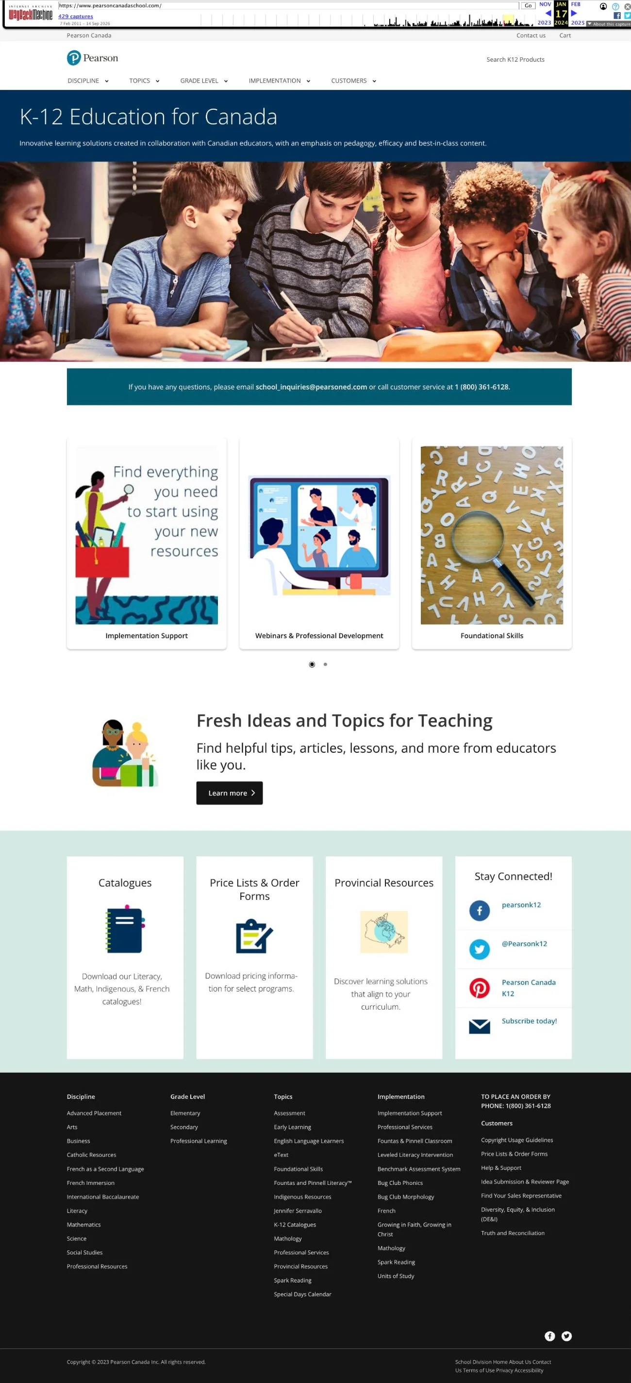
School buyers couldn’t find inventory or work out how to order on Pearson Canada’s 1,300+ page K-12 site.

We rebuilt the information architecture informed by CRO and SEO, addressed the UX issues and, midway, adapted the work to Pearson’s new global brand.

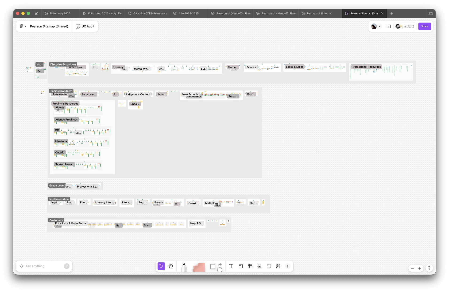
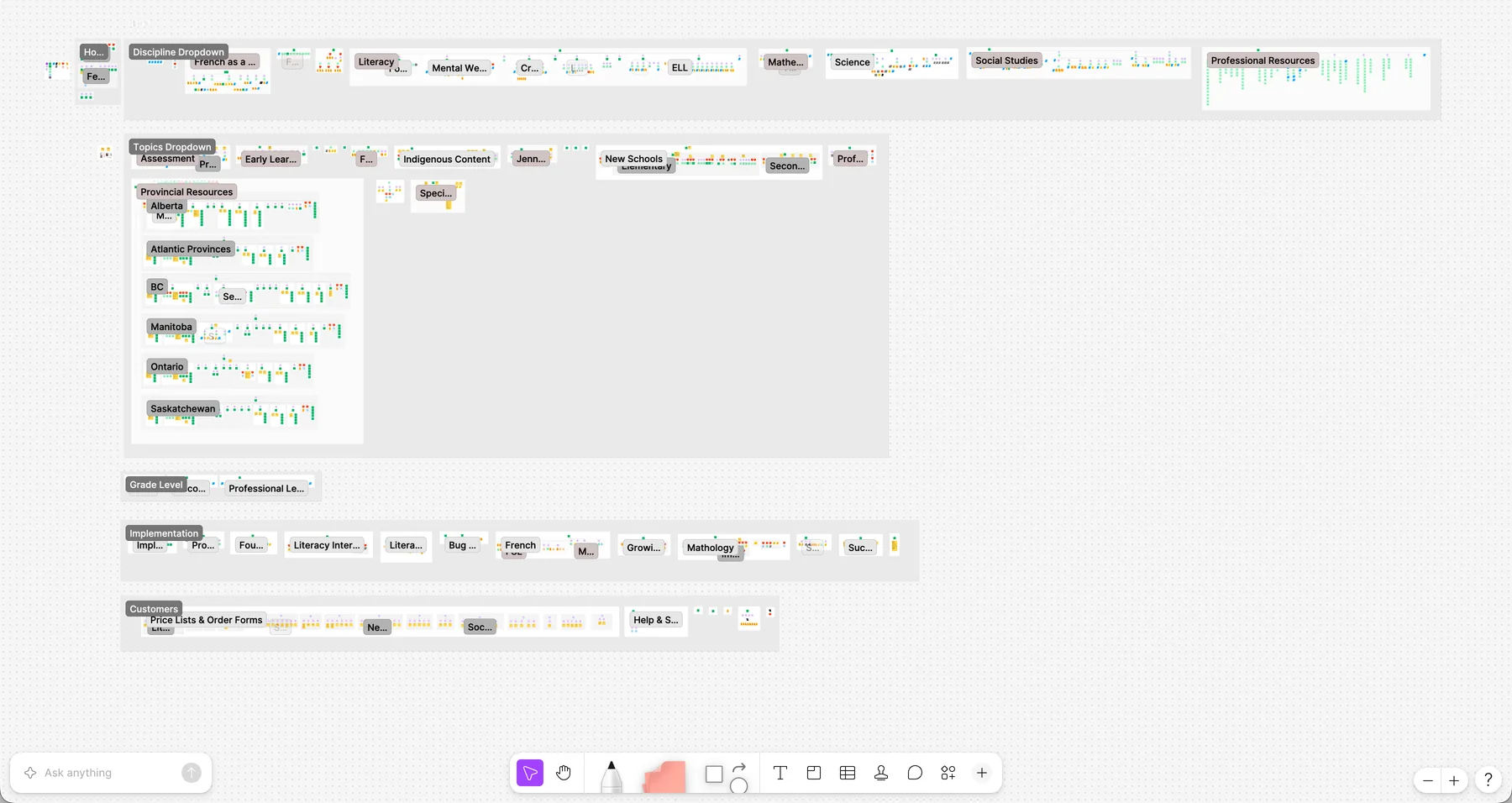
On the left is the old website with over 1,300 pages. On the right is the audit where we catalogued the flows and where they conflict, and identified areas to improve conversion and order completion.
01—

Buying moved into the main nav

Ordering was a maze and the main option to buy was calling a rep. Information flowed differently across products, so a buyer could take 4 steps in Literacy but 10 steps in Math, and neither had the same information structure. To address this:

  • We gave ordering its own section
  • Added a clear “buy now” call to action on main page heroes
  • The homepage leads with Order Now and Contact a Rep
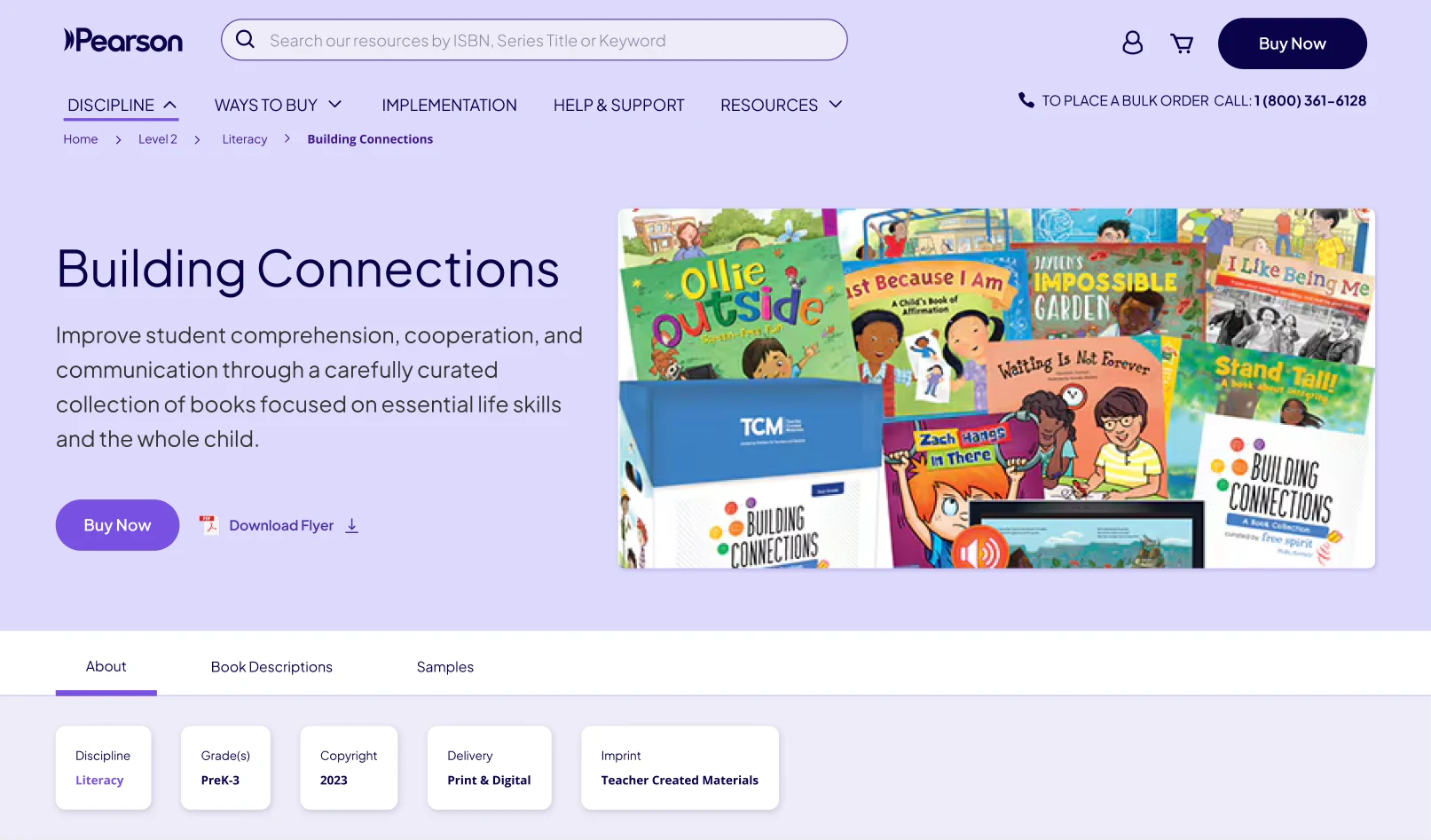
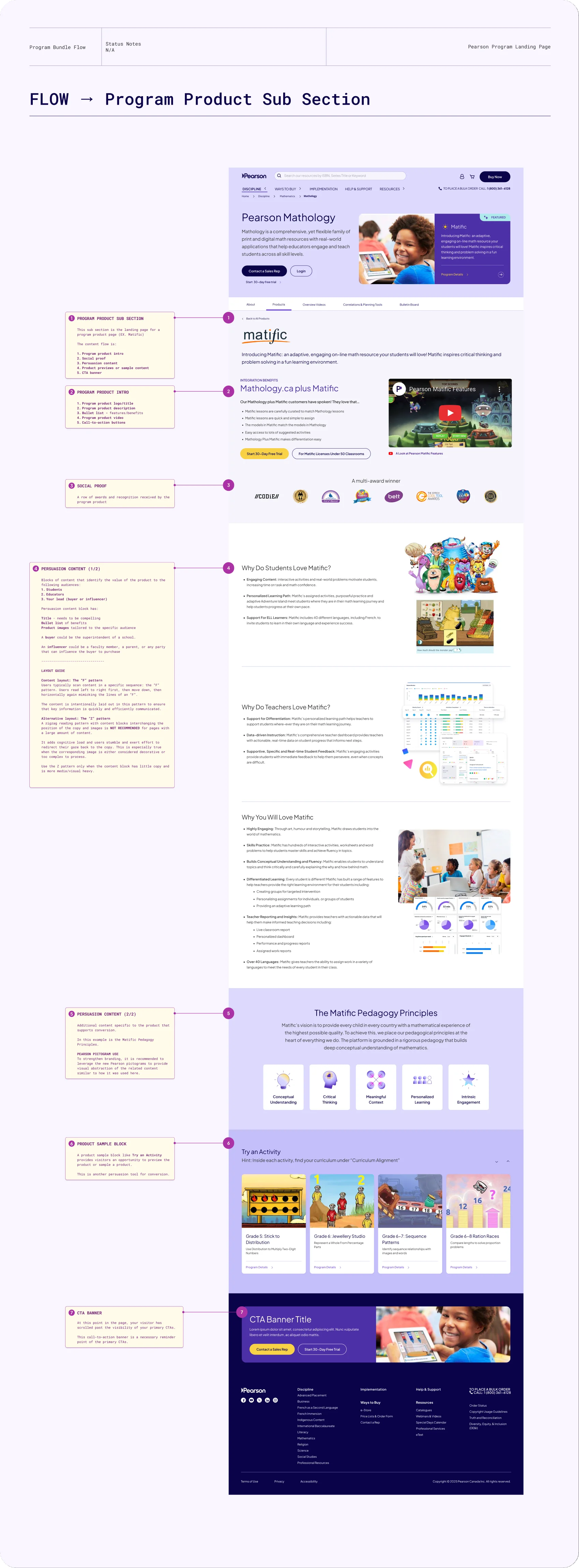
  • Consolidated the program flow pages to have the same information structure with the same order patterns
Clear purchase paths for superintendents, faculty, and parents
02—

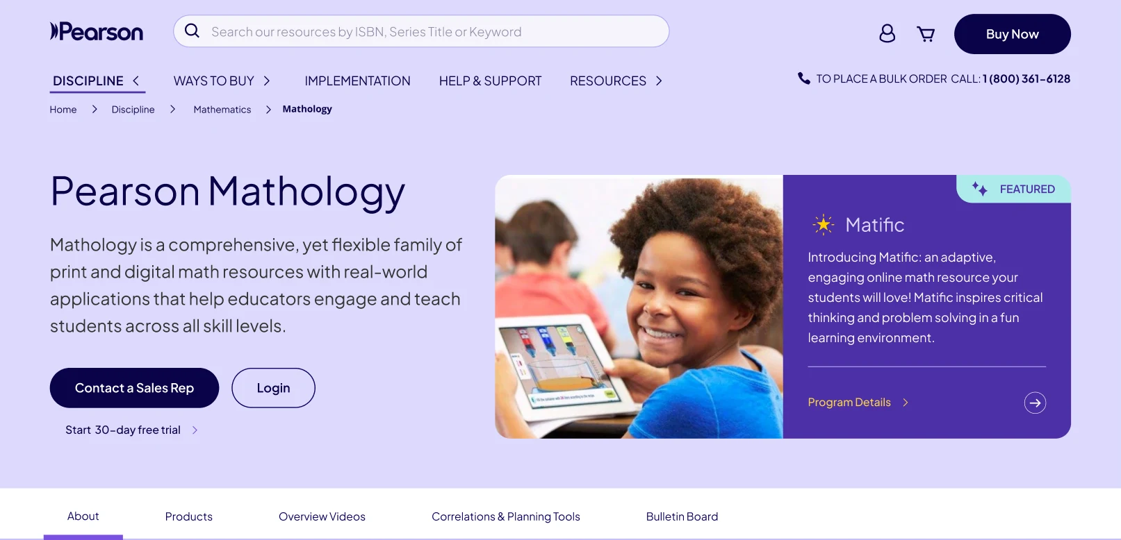
One buying flow for 12 disciplines

Each discipline had its own pages and marketing team, with no shared way of structuring product pages. Every discipline showed up differently to the end user, which led to confusion and frustration in the sales process.

Pearson is built on Adobe Experience Manager and there were limitations in what patterns were available to use. We worked together with the Pearson London AEM team to consolidate the designs using patterns in AEM.

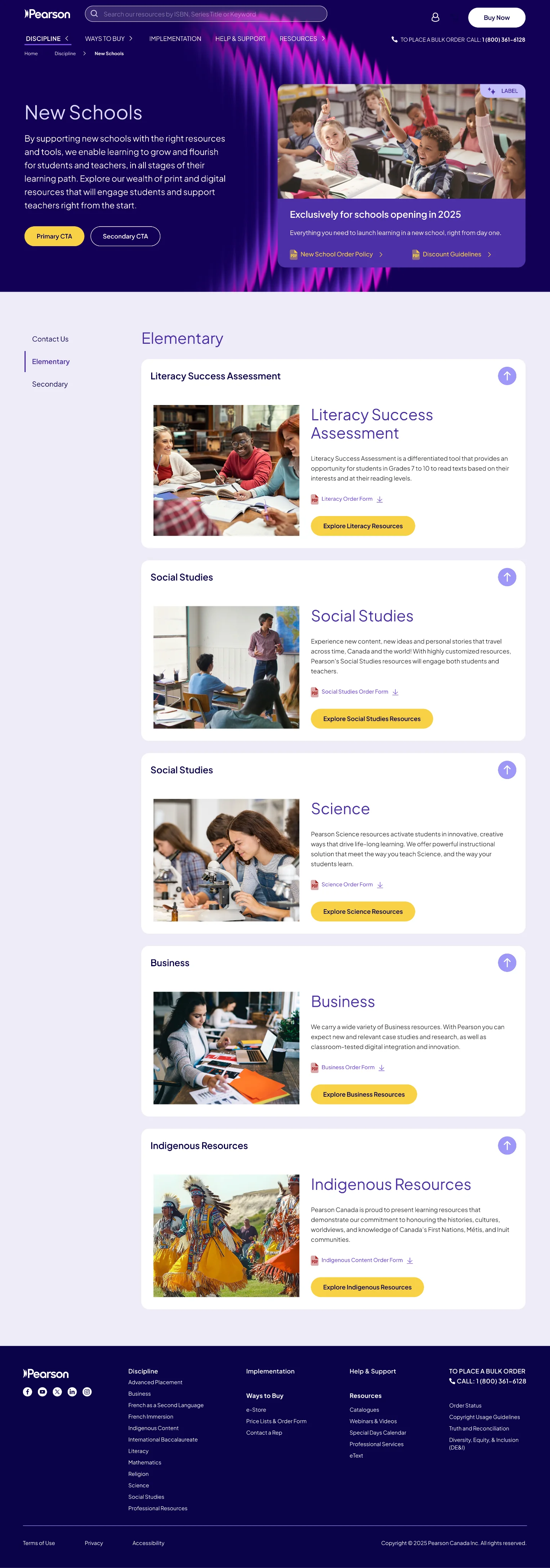
  • Program types as tabs, the same on every discipline
  • Sidebar navigation and accordions for consistent wayfinding and managing cognitive load
  • Interactive cards that lead to purchase instead of being read-only
  • One structure for buyers, one pattern for Pearson
03—

A global rebrand, midway through handoff

Our project coincided with a global rebrand for Pearson. Midway through handoff, we received the new brand to implement. We kept the structure and rebuilt the look to match the new brand.

  • Deep purples and wave graphics in place of black and blue
  • An illustrated cover per discipline, reused as its page hero
  • Reworked block patterns and card styles to match other online Pearson properties
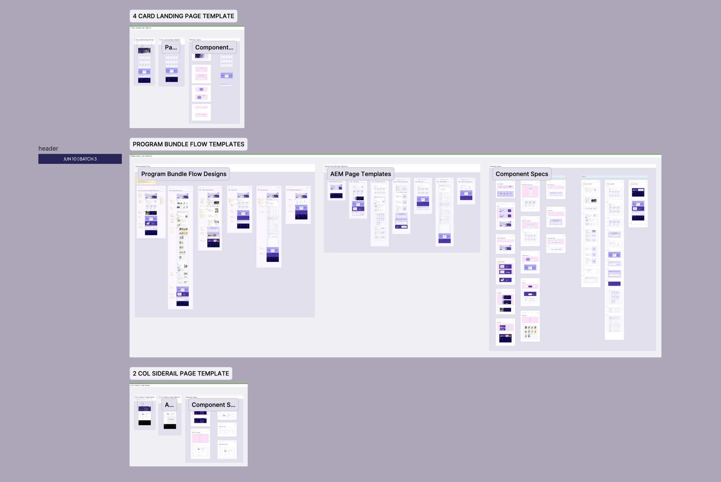
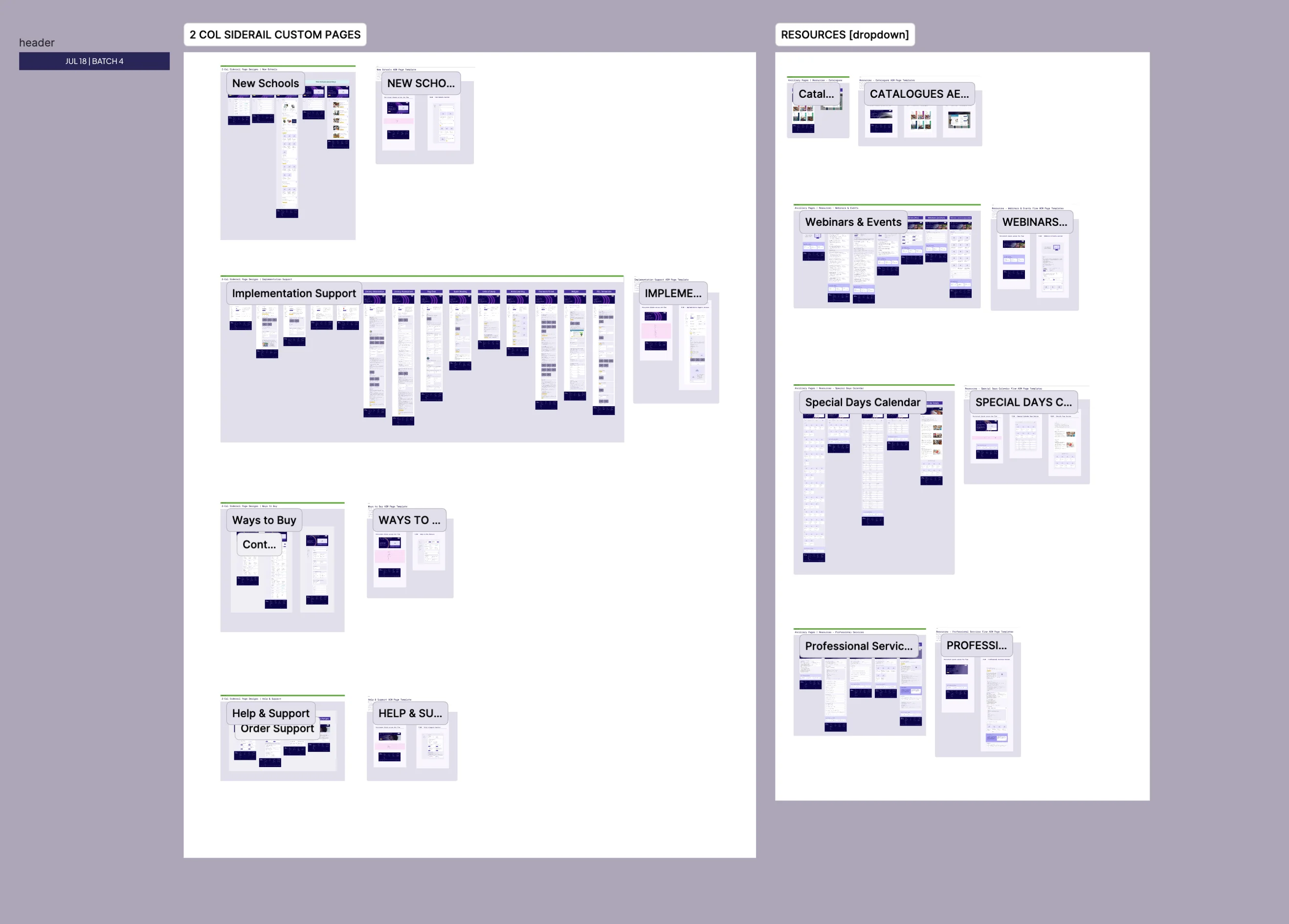
A selection of the new components
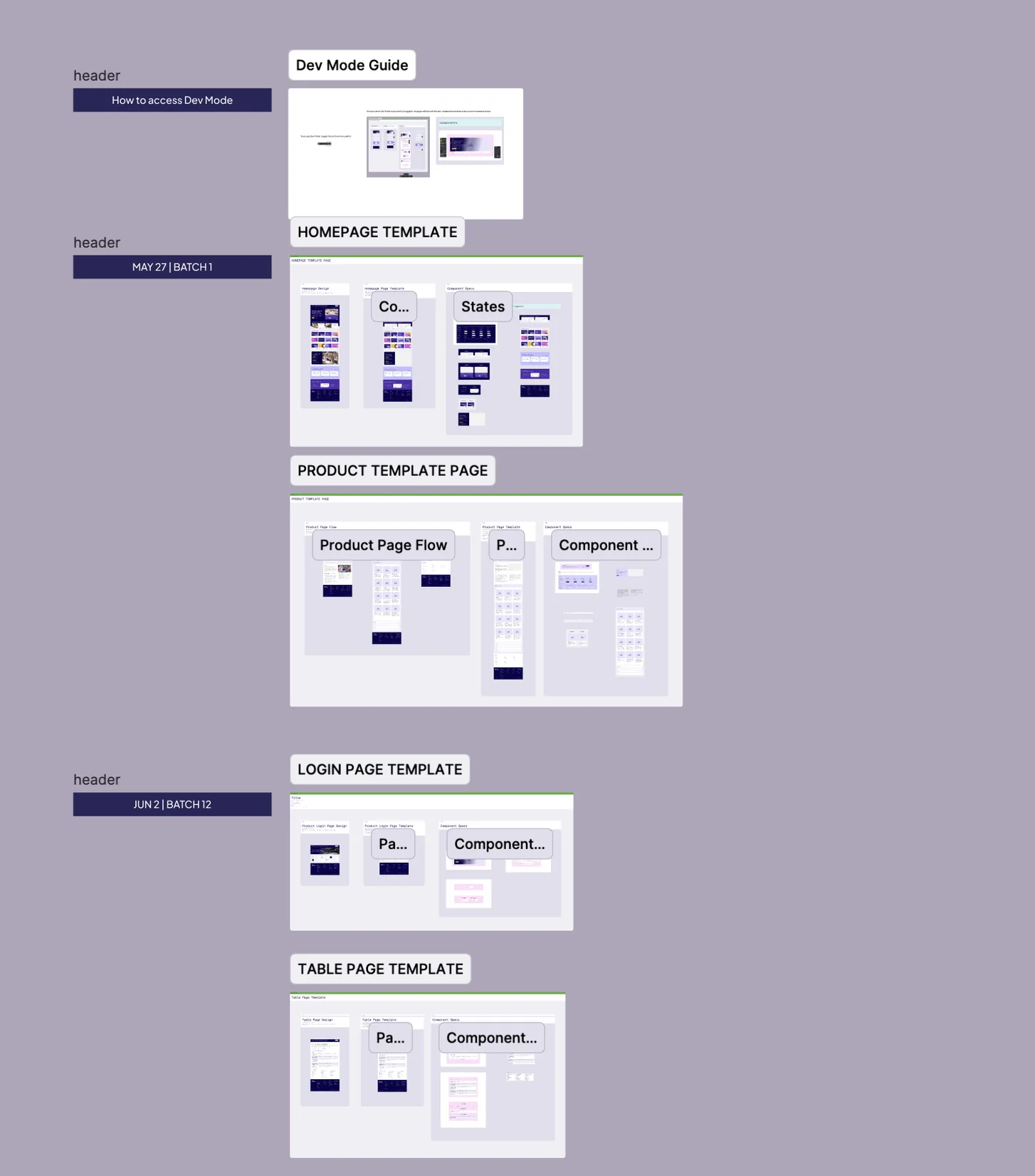
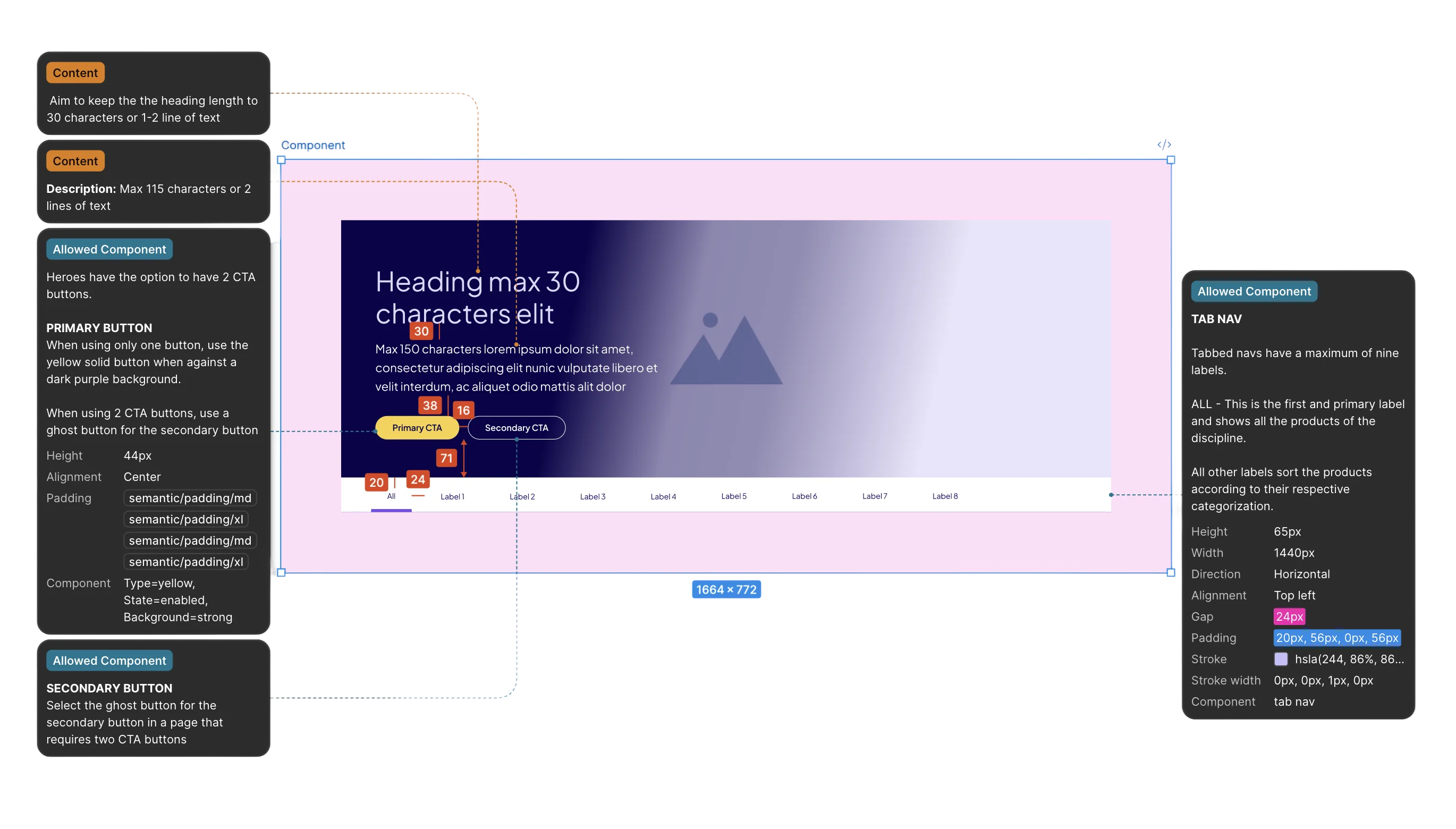
The full breadth of the handoff file.
Flows were annotated to guide the Pearson team in optimizing content for conversion.
Components also included guides for information hierarchy.
Three of the key screens, showing the improved information architecture and a clearer ordering flow.

Learnings

Getting early access to AEM, and to the Pearson team managing it, meant we factored in development constraints from the get-go. We saved time by focusing on what mattered, and set the program owners up for success with clear recommendations on structuring content for purchase.

The tradeoff: we weren’t part of the implementation. The handoff went well, and the live site follows the information structure, but AEM’s limits meant some of the design didn’t carry over one to one. Being there for the build would have let us support the team as they made the AEM patterns.

/FEEDBACK

Sheldon: Trace has a fantastic visual sensibility and brought real polish to our product.

01 / 08Jotson
Sheldon ManabatSenior Software Developer

Trace was instrumental in our product design efforts to deliver a clean and scalable design system that made development smooth and efficient. She brought real polish to our product through her thoughtful approach to iconography and visual design.

Her ability to balance design thinking with practical execution made her contributions incredibly valuable from both a product and engineering perspective.

Working alongside Trace at Helcim was an absolute pleasure. I genuinely miss our collaboration.

If I had to highlight one of her many strengths, it would definitely be her talent for identifying solutions where none previously existed. Her approachability and support made challenging scenarios much smoother, and I was genuinely grateful to have her partnership.

I loved how she brought fresh ideas to the table, explained everything clearly, and kept everyone on track toward our goals. The design system she built for us finally gave us the consistency we needed.

Trace works fast without sacrificing quality, quickly grasps complex information, and always delivers valuable insights. She’s approachable, genuinely cares about the work and was a true pleasure to collaborate with. I can’t recommend her enough!

I appreciate Trace's organized and analytical mind. She communicates clearly and helps add extra clarity to processes that might otherwise be muddy and unorganized.

She advocated for us, fostered collaboration, and invested in everyone’s growth. Her leadership created an environment where we could do our best work and support each other.

I learned so much from her about what it means to lead.

If I had to point out at one of her strongest skills, that would definitely be the ability to look at a design piece, understand that something is off, and turn that vague feeling into an objective and actionable feedback.

This ability to effectively deliver feedback has brought a lot of value to the team output and increasing their work quality.

When the client struggled with inconsistencies and scalability issues in their design system, Trace’s deep understanding of both design principles and technical constraints allowed her to implement a solution that not only addressed these challenges but also improved the overall user experience. The impact of her work cannot be overstated.

Her innovative approach to simplifying the design system was a game changer, leading to greater consistency, efficiency, and ease of use for the team.

She is a very strong leader and has immense skill in leading client workshops, especially in the UX and CDR space.

What’s up, what’s up.

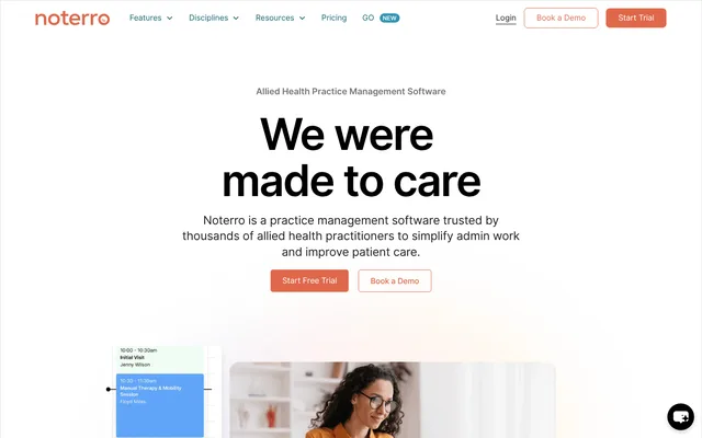
Currently at Noterro, a health tech, leading design on the core platform and building a design-to-code workflow loop with a design system that’s readable by AI on Figma and from the codebase.

Before that, I led design operations at Helcim and designed products for B2B, B2C, and 0-1 startups at Tiller.

I’ve been lucky to work product end to end. That means weaving comfortably between product discovery, product design, brand design, and design systems.

When off duty, I’m building internal tools and micro apps for fun.

If you’re looking to geek out about AI and design, I’d love to chat. Reach out and we can swap .md skills.