I’m Trace, a designer building design<>code workflows with AI and design systems

/PROJECTS

FIG. 01AI/WF
NAME
AI workflows
NOTES
Harnesses in Obsidian. Chains of .md skills. Agent workflows (essentially cron jobs) serving Discworld emojis and Futurama memes.
AI workflows

Harnesses in Obsidian. Chains of .md skills. Agent workflows (essentially cron jobs) serving Discworld emojis and Futurama memes.

/SELECTED WORK

Olsen AI Brand & Web: A new brand and website, live the day before its biggest conference

  • CONSTRUCTION
  • BRAND
  • ART DIRECTION
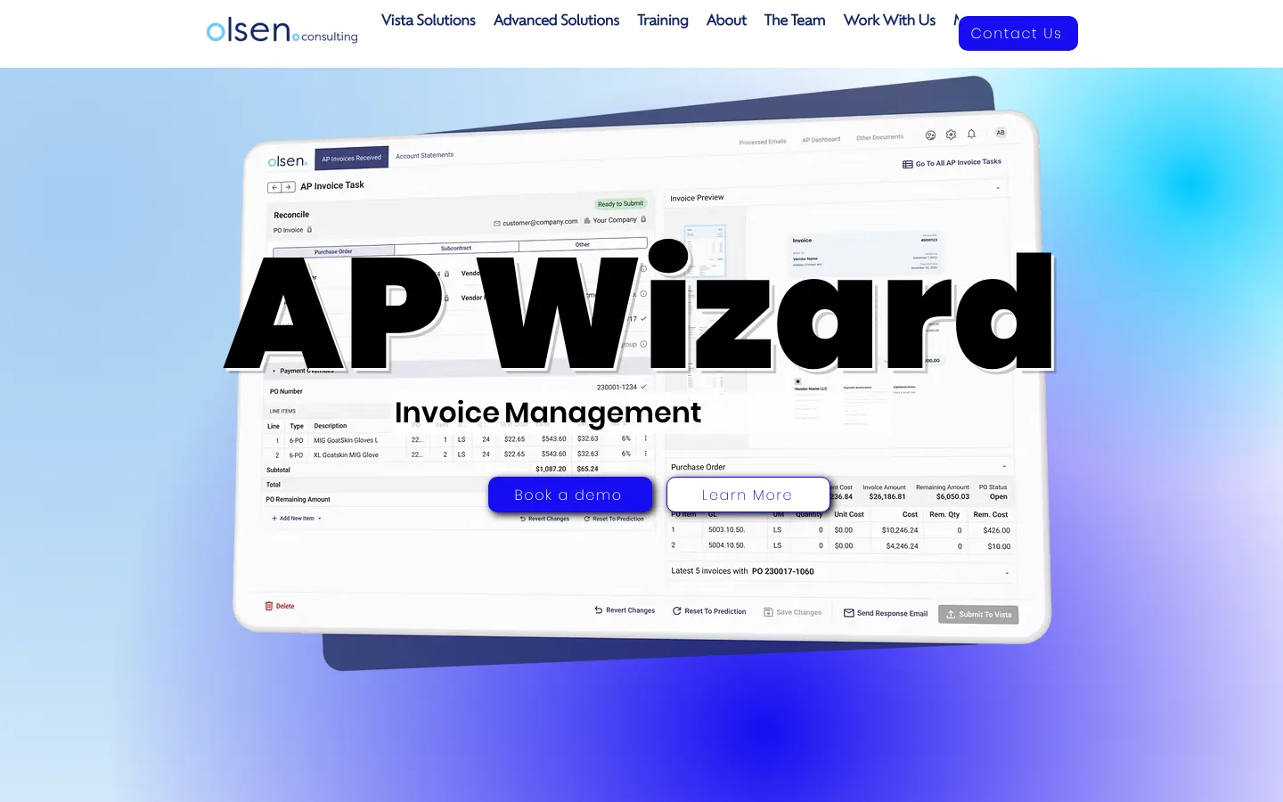
The old olsenconsulting.ca homepage with a giant AP Wizard headline over a cyan gradient

BEFORE

olsenconsulting.ca

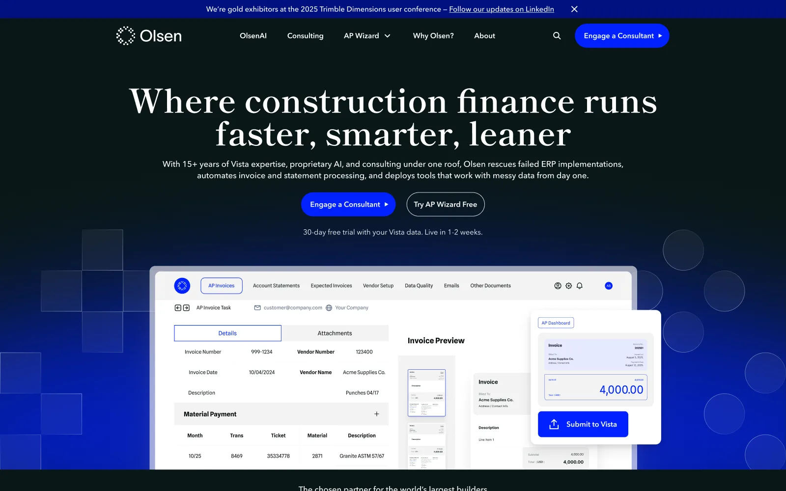
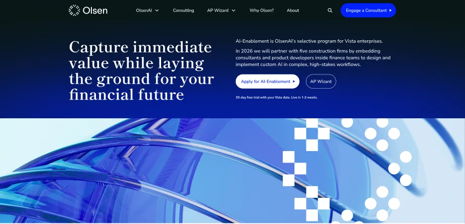
The approved olsenai.com homepage with a serif headline on near-black and blue

AFTER

olsenai.com, approved design

BEFORE & AFTER
The old Wix homepage next to the approved homepage for the new brand.
STYLE TILE TO LIVE SITE
<5 wks
From first style tile review to live site [confirm: Oct 8 to Nov 9, 2025]
REVIEW ROUNDS
7
Between Oct 8 and Oct 27
TO SPARE
1 day
Before Trimble Dimensions 2025 opened
GOLD SPONSOR AND SPEAKER
Year 2
At Dimensions 2026, on the same brand
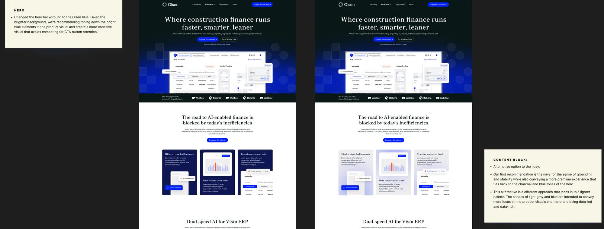
Two colour variants of the merged homepage direction with review notes
OCTOBER 14
Two colour variants of the merged direction, with our notes. The navy content cards shipped.

tl;dr

Olsen started as a Vista ERP consultancy in Calgary and grew into a company building AI for construction accounting teams. Its old Wix site still looked like a small IT shop. At Tiller I art directed a new brand with Ihor and led the website design, including its information architecture. I also prepared Olsen’s presentation deck for Trimble Dimensions 2025. All of it was ready for the event.

01—

Where Olsen was starting from

The old site was a Wix build with a lowercase cyan “olsen consulting” wordmark. The homepage opened on a giant black “AP Wizard” set over a tilted product screenshot and a cyan gradient, with isometric icons and a stock classroom photo further down. The nav split the business into Vista Solutions, Advanced Solutions and Training. Olsen had become a company with its own AI products for finance teams, and the site didn’t show it.

02—

A brand built from one mark

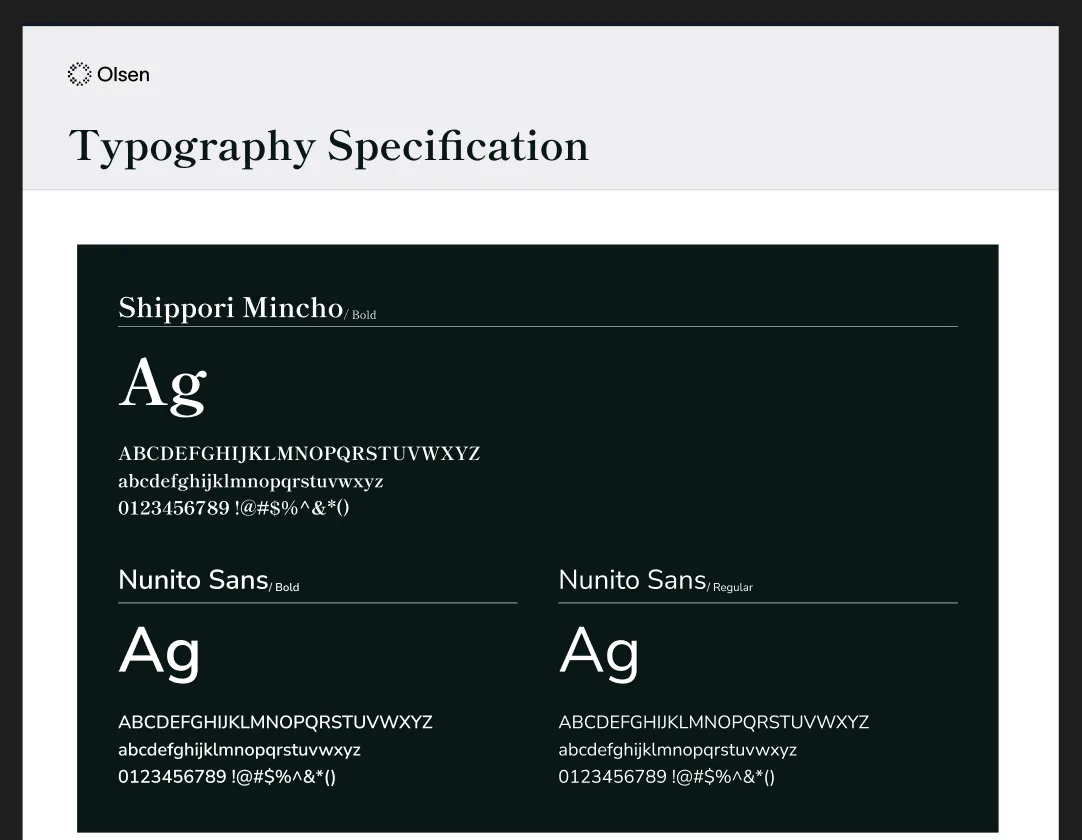
Ihor and I designed the identity together. The mark is a ring of small squares and dots that breaks apart at the edges. [Trace: one line on the idea behind the mark.] The rest of the brand comes out of it. The squares and circles scale up into translucent tiles that drift behind heroes and banners, and a sharper chequerboard version sits over glassy 3D renders. We paired Shippori Mincho, a high-contrast serif, with a clean sans for body copy. The palette is an electric blue, #0021FF, on a near-black green. The serif gives Olsen the weight of a finance brand and the blue puts it with the software companies it now competes with.

Logo explorations [placeholder, brand file]
OlsenAI page hero with a glassy 3D render under the chequerboard pattern
Typography specification: Shippori Mincho with Nunito Sans
THE MARK IN USE
The chequerboard pattern over a 3D render, and the type pairing.
03—

Two directions on day one

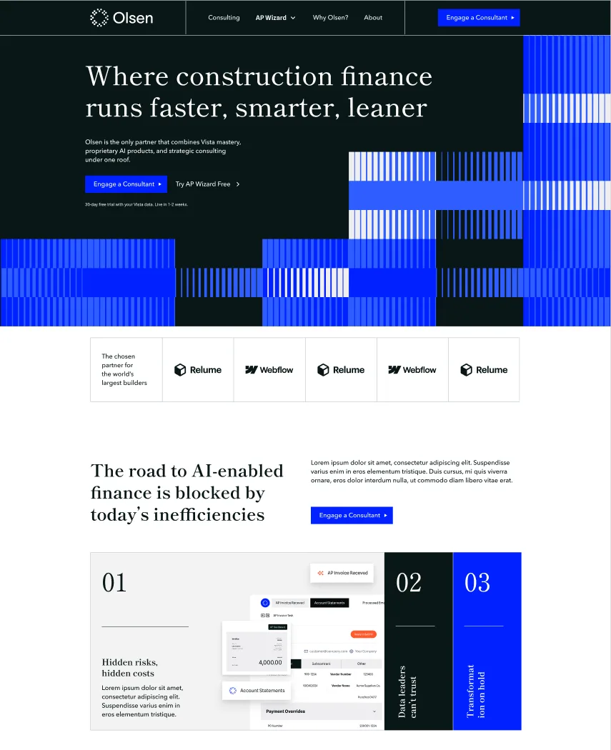
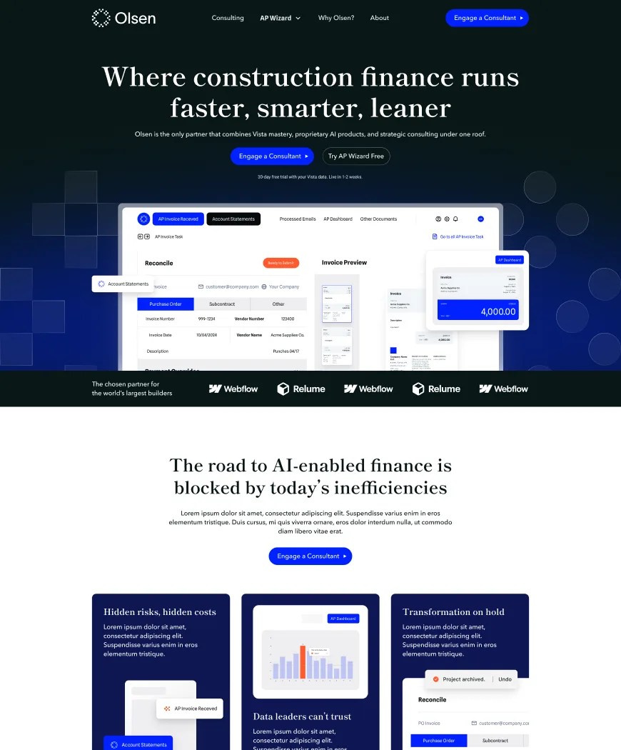
For the website we showed Olsen two style tiles on October 8. The first stretched the logo’s pattern into bold blue barcode stripes. The second used a charcoal-to-blue gradient with the AP Wizard interface floating over it and the logo’s shapes drifting behind. Olsen picked the second and asked to keep the numbered card row from the first, so we merged them that day. On October 14 we brought two colour variants of the merged direction. We recommended deep navy content cards for a grounded, premium feel, and that’s what shipped.

Style tile Olsen-01 with blue barcode stripes
Style tile Olsen-02 with a charcoal-to-blue gradient and the AP Wizard interface
OCTOBER 8
Olsen-01 and Olsen-02 side by side.
04—

A site that sells the way Olsen sells now

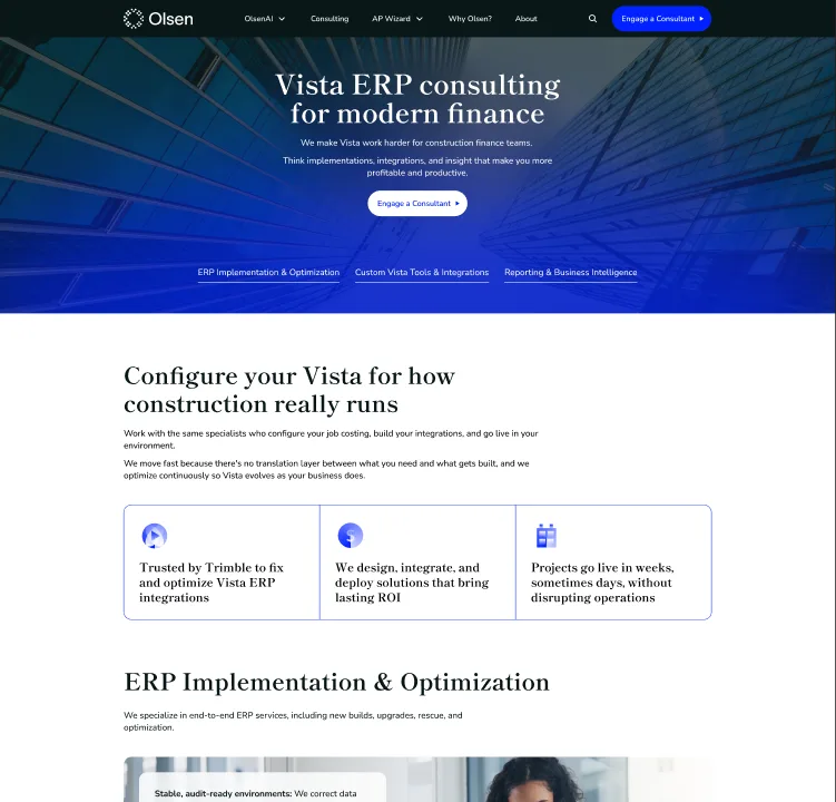
I restructured the site around how Olsen sells today. AP Wizard got its own overview with a free trial path. Consulting pulled the old Vista tools, implementation and reporting pages into one place. OlsenAI introduced the AI-Enablement cohort, while Why Olsen and About carried the story in Jon Olsen’s voice. “Engage a Consultant” sits in the top right of every page.

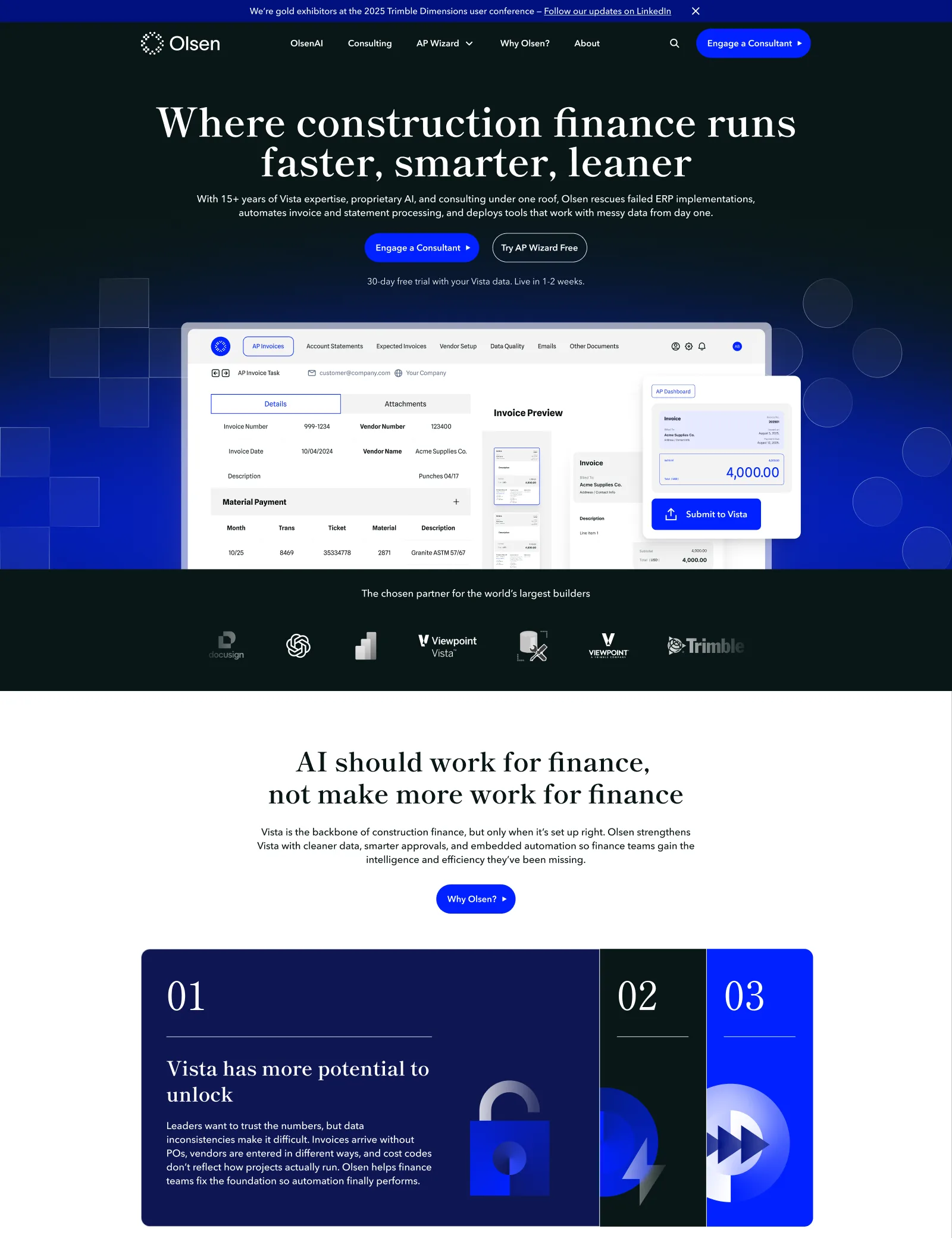
The approved Olsen homepage design
THE APPROVED HOMEPAGE
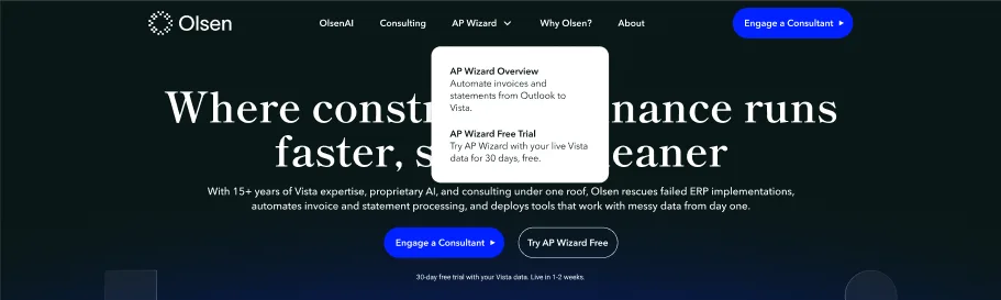
Olsen navigation with the AP Wizard menu open
NAVIGATION
The nav with the AP Wizard menu open.
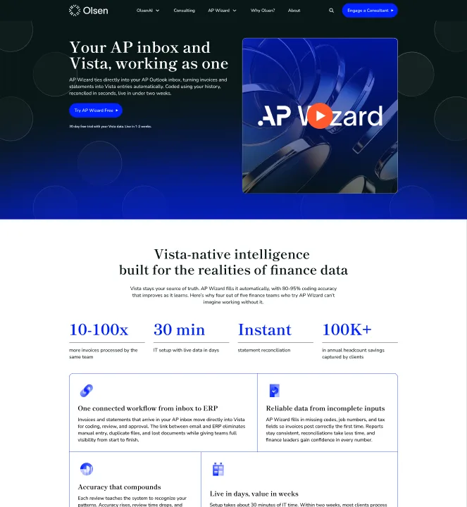
AP Wizard overview page
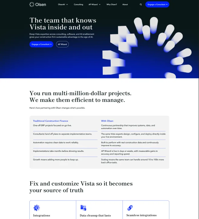
Why Olsen page
Consulting page
THE PAGES
AP Wizard Overview, Why Olsen and Consulting.
05—

Motion and handoff

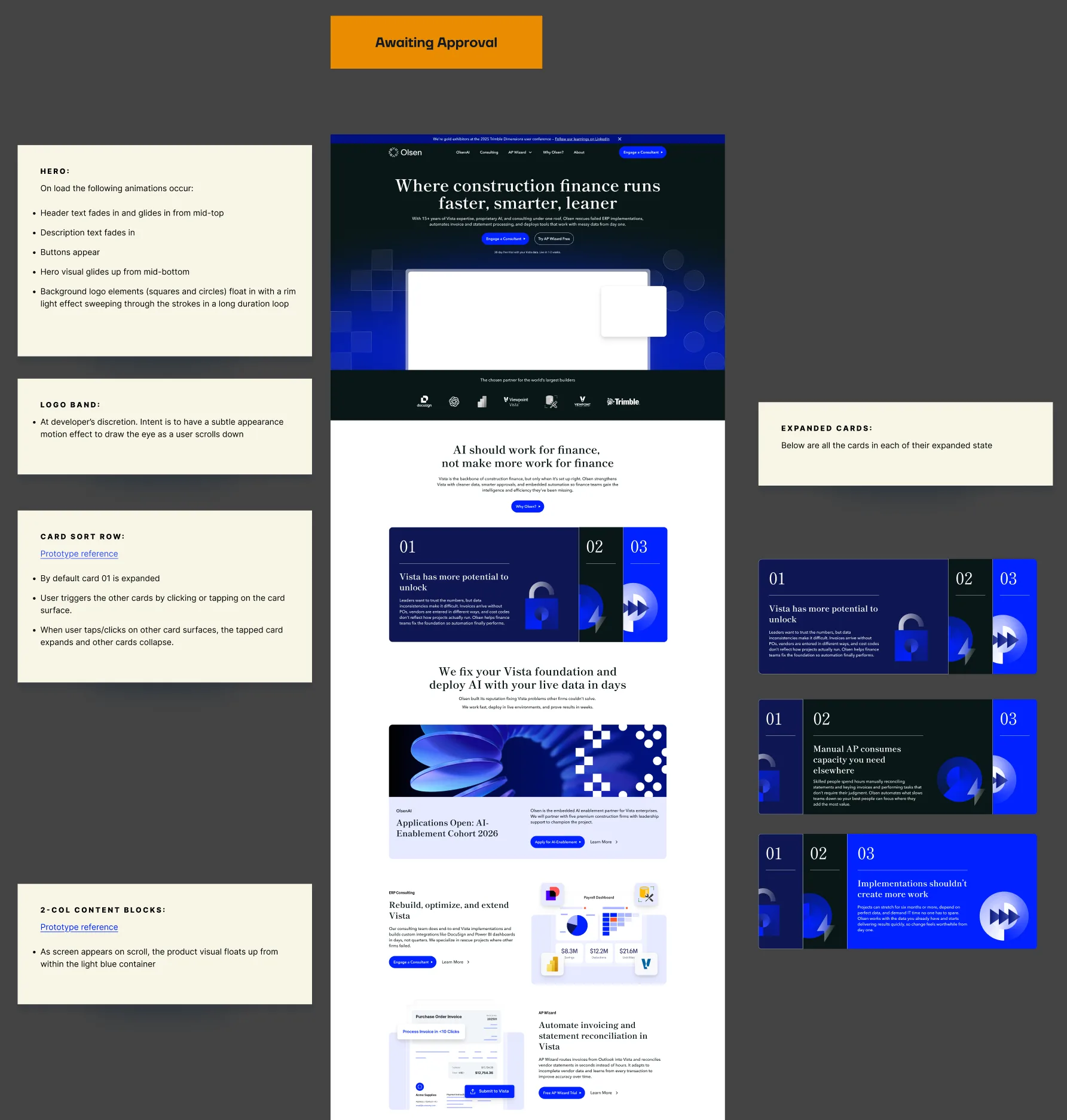
By the fourth round the boards carried motion notes for the developers. The hero visual lifts up from the midpoint while the logo’s squares and circles float in with a rim light sweeping through their strokes. The numbered cards sort themselves into place as you scroll. Typography and spacing specs went over with the approved pages, along with mobile layouts where the card rows turn into swipeable carousels.

October 21 homepage board with motion notes for developers
OCTOBER 21
The homepage board with motion notes.
The approved mobile homepage
06—

The convention deck

With the brand in place I prepared Olsen’s presentation deck for Trimble Dimensions 2025 and the assets that went with it. [Trace: talk title, who presented, two or three specifics about the deck.] The new homepage carried a banner announcing Olsen as a gold exhibitor at the conference.

Deck slides [placeholder, deck file]
07—

A year later

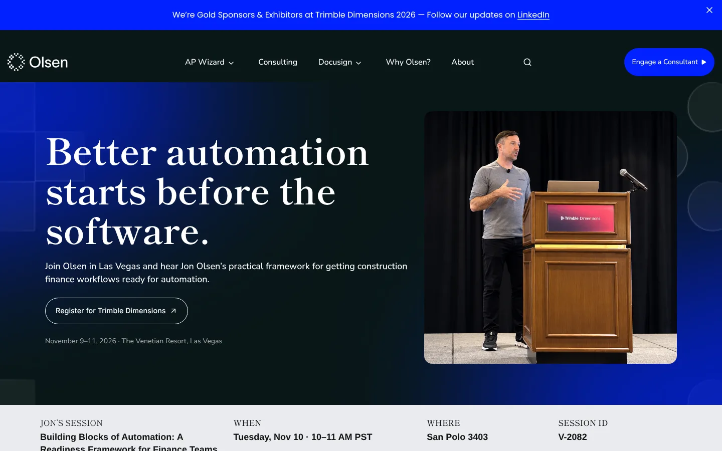
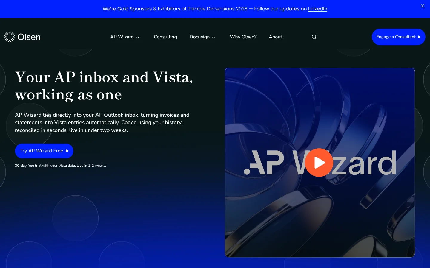
Olsen is still building on the brand. The site has grown to 18 pages in the same look, including new Docusign Wizard pages and a page for Dimensions 2026. This November Olsen is back at Dimensions as a Gold Sponsor, and Jon is on the speaker list.

The live Trimble Dimensions 2026 page on olsenai.com
The live AP Wizard page on olsenai.com
LIVE TODAY
The Dimensions 2026 page and the AP Wizard page.

Learnings

Showing two complete style tiles at the first review got us specific feedback right away. Olsen came back with a preference for every section of the page, and we could merge the two directions the same afternoon.

The deck was the first time the brand had to work away from the website. [Trace: what held up, and what you had to add for slides and the booth.]

Tiller, Calgary. Art director and lead designer: Trace Orozco. Brand co-designer: Ihor [surname]. Designer: [name]. Client: Jon Olsen, Founder and CEO, Olsen. [Confirm Tiller credit wording.]

/FEEDBACK

Rodolfo: Working with Trace has been a delightful experience that made me grow as a leader.

01 / 06Helcim
Rodolfo Ferro CasagrandeHead of Design

If I had to point out at one of her strongest skills, that would definitely be the ability to look at a design piece, understand that something is off, and turn that vague feeling into an objective and actionable feedback.

This ability to effectively deliver feedback has brought a lot of value to the team output and increasing their work quality.

Trace was instrumental in our product design efforts to deliver a clean and scalable design system that made development smooth and efficient. She brought real polish to our product through her thoughtful approach to iconography and visual design.

Her ability to balance design thinking with practical execution made her contributions incredibly valuable from both a product and engineering perspective.

I loved how she brought fresh ideas to the table, explained everything clearly, and kept everyone on track toward our goals. The design system she built for us finally gave us the consistency we needed.

Trace works fast without sacrificing quality, quickly grasps complex information, and always delivers valuable insights. She’s approachable, genuinely cares about the work and was a true pleasure to collaborate with. I can’t recommend her enough!

When the client struggled with inconsistencies and scalability issues in their design system, Trace’s deep understanding of both design principles and technical constraints allowed her to implement a solution that not only addressed these challenges but also improved the overall user experience. The impact of her work cannot be overstated.

Her innovative approach to simplifying the design system was a game changer, leading to greater consistency, efficiency, and ease of use for the team.

I appreciate Trace's organized and analytical mind. She communicates clearly and helps add extra clarity to processes that might otherwise be muddy and unorganized.

She advocated for us, fostered collaboration, and invested in everyone’s growth. Her leadership created an environment where we could do our best work and support each other.

I learned so much from her about what it means to lead.

What’s up, what’s up.

Currently at Noterro, building a design-to-code workflow loop with a design system that’s readable by AI on Figma and from the codebase.

Before that, I led design operations at Helcim and designed products at Tiller.

I’ve been lucky to work product end to end. That means weaving comfortably between product discovery, product design, brand design, and design systems.

When off duty, I’m building internal tools and micro apps for fun.

If you’re looking to geek out about AI and design, I’d love to chat. Reach out and we can swap .md skills.