
I’m Trace, a designer building design<>code workflows with AI and design systems

/PROJECTS

FIG. 01AI/WF
NAME
AI workflows
NOTES
Harnesses in Obsidian. Chains of .md skills. Agent workflows (essentially cron jobs) serving Discworld emojis and Futurama memes.
AI workflows

Harnesses in Obsidian. Chains of .md skills. Agent workflows (essentially cron jobs) serving Discworld emojis and Futurama memes.


/SELECTED WORK

One Exchange Product Update: A calmer trading platform for crude and NGL traders

  • COMMODITIES TRADING
  • UX
  • PRODUCT DESIGN
UX IMPROVEMENTS
[x]
Changes to how OX Trading works, from New Order to confirmations
LOGIN DESIGN
1
Every OX platform’s login follows one design, each keeping its own name
ISSUES ADDRESSED
[x]/27
Of the audit issues logged on OX Trading
APP AND WEB The trading app and the One Exchange site in the new brand.

tl;dr

One Exchange (OX) runs electronic trading platforms for crude oil and natural gas liquids. After its rebrand, the platforms still used their old interfaces, and each one had its own login with its own look.

I audited the platforms, then redesigned OX Trading, the core platform, in the new brand. The trading screen keeps its layout so traders’ habits still work. The changes cut colour back to where it carries meaning, give actions a clear order of importance, and make orders quicker to place and confirm. Handed off to One Exchange’s developers in 2026.

After
Before
LOGIN, BEFORE AND AFTER Drag to compare the old login with the new one.
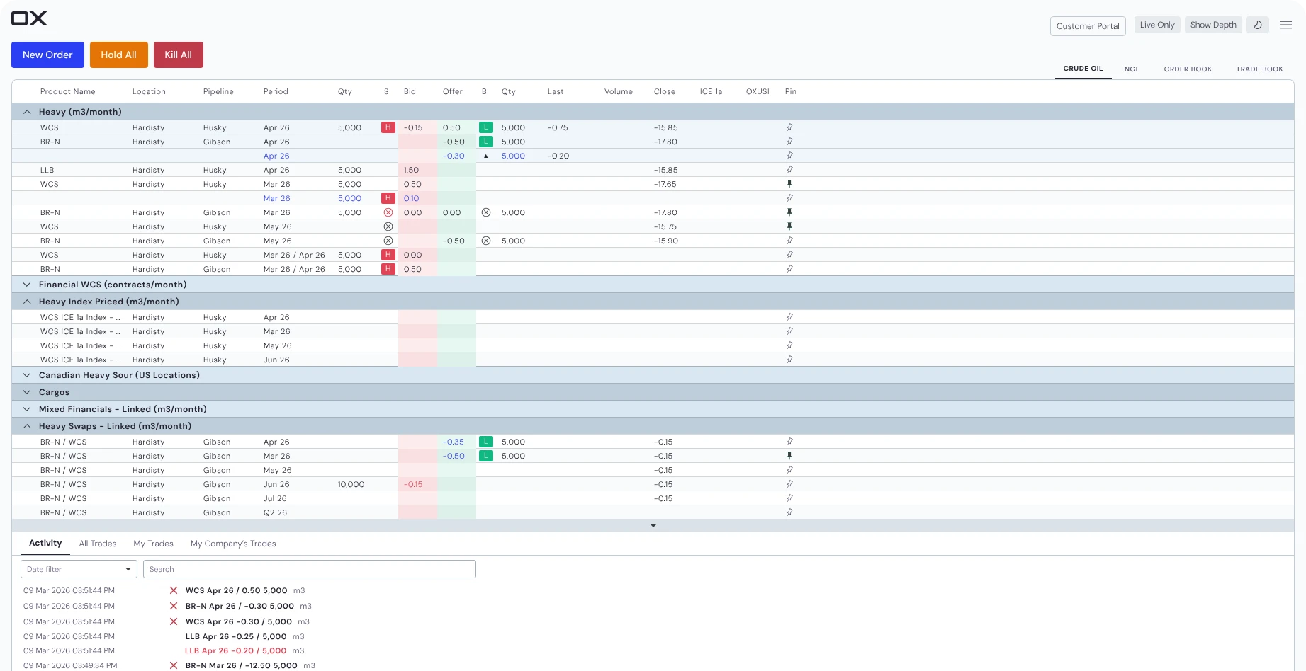
The new trading screen: calm buttons, soft group bars, and colour kept to bids and offersAfter
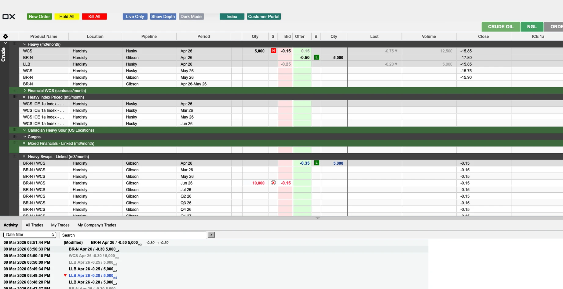
The old trading screen: saturated buttons, dark and green group bars, and the Crude market gridBefore
TRADING SCREEN, BEFORE AND AFTER Drag to compare. Colour now stays on bids, offers and order state.
01—

Four platforms, four different logins

Traders sign in to several OX platforms, and each has its own login. Before the redesign those logins shared nothing: a card on a teal gradient, a dark form under the old logo, a grey header bar over a plain form.

Each platform still keeps its own login. They now follow one design in the new brand, with each platform’s name on its own screen, so the experience is consistent from the first screen a trader sees.

NEW ORDER The form steps through Bid, Offer and Bid & Offer. Tap a tab or an order kind to switch.
02—

Keep the layout, lower the load

The work focused on OX Trading, the core platform. It began with an audit of all four platforms and a dive into how commodities trading works: how traders and brokers make a trade, and what terms like hit, lift, depth and implied mean on screen.

OX’s traders move fast and have firm habits, so we kept most of the trading screen’s structure. The changes went into cognitive load: a clear order of importance for actions, and colour only where it carries meaning, with one logic for bids, offers and order states.

What the audit found on OX Trading

  • Hold All and Kill All sat side by side with equal weight, so one misclick could pull every order
  • New Order was green, like much of the screen, so it didn’t stand out
  • Bid and offer colours clashed with how negative values were coloured
  • The sell confirmation had no total, so traders couldn’t check what they were committing to at a glance
03—

Clear intent in every action

Frequent actions that sat in dropdowns moved into view, like the three order kinds in New Order, and the order forms got quicker to fill. Confirmations now say what will happen: the sell confirmation shows the product, total quantity and price, and Hold All and Kill All ask first.

On mobile, the desktop page in a web wrapper became an app, with light rows, groups that fold and swipe actions.

HOLD ALL AND THE MARKET GRID Hold all asks before it acts. Rows light up under the cursor, and groups fold.

Designed and handed off

Handed off in 2026. One Exchange’s engineers are building it, so there are no shipped numbers yet.

How we’d know it worked

  • Fewer order errors, and fewer support calls about them
  • Time to place an order
  • Login completion rate
  • Password reset tickets

[Learnings title]

[What you learned, in your words.]

/FEEDBACK

Rodolfo: Working with Trace has been a delightful experience that made me grow as a leader.

01 / 06Helcim
Rodolfo Ferro CasagrandeHead of Design

If I had to point out at one of her strongest skills, that would definitely be the ability to look at a design piece, understand that something is off, and turn that vague feeling into an objective and actionable feedback.

This ability to effectively deliver feedback has brought a lot of value to the team output and increasing their work quality.

Trace was instrumental in our product design efforts to deliver a clean and scalable design system that made development smooth and efficient. She brought real polish to our product through her thoughtful approach to iconography and visual design.

Her ability to balance design thinking with practical execution made her contributions incredibly valuable from both a product and engineering perspective.

I loved how she brought fresh ideas to the table, explained everything clearly, and kept everyone on track toward our goals. The design system she built for us finally gave us the consistency we needed.

Trace works fast without sacrificing quality, quickly grasps complex information, and always delivers valuable insights. She’s approachable, genuinely cares about the work and was a true pleasure to collaborate with. I can’t recommend her enough!

When the client struggled with inconsistencies and scalability issues in their design system, Trace’s deep understanding of both design principles and technical constraints allowed her to implement a solution that not only addressed these challenges but also improved the overall user experience. The impact of her work cannot be overstated.

Her innovative approach to simplifying the design system was a game changer, leading to greater consistency, efficiency, and ease of use for the team.

I appreciate Trace's organized and analytical mind. She communicates clearly and helps add extra clarity to processes that might otherwise be muddy and unorganized.

She advocated for us, fostered collaboration, and invested in everyone’s growth. Her leadership created an environment where we could do our best work and support each other.

I learned so much from her about what it means to lead.

What’s up, what’s up.

Currently at Noterro, building a design-to-code workflow loop with a design system that’s readable by AI on Figma and from the codebase.

Before that, I led design operations at Helcim and designed products at Tiller.

I’ve been lucky to work product end to end. That means weaving comfortably between product discovery, product design, brand design, and design systems.

When off duty, I’m building internal tools and micro apps for fun.

If you’re looking to geek out about AI and design, I’d love to chat. Reach out and we can swap .md skills.