WAITWELL
Redesigning a queue management platform, driving a 30% increase in engagement
ART DIRECTION
VISUAL LANGUage
brand design

WAITWELL'S BRAND EVOLUTION was more than a website redesign, it was a strategic shift to refine its identity and strengthen its position in the queue management space. WaitWell reached out to Tiller to help them evolve their website and bring their ambitions to life. At Tiller, I worked hands-on to refine the brand identity, collaborating closely with the Tiller design team to ensure consistency across all touchpoints. Together, we developed a comprehensive brand guide and introduced product-centric visuals and branded elements for the new website and marketing materials. This effectively raised WaitWell’s presence and set it apart in a competitive market.
01
Strengthening the brand to drive business growth
WaitWell had an established product with strong market traction, but its existing branding and website did not effectively communicate its value proposition. The previous visual identity needed to change to support product scalability, while the web experience required improvements to be more visually engaging, product-focused, and optimized for conversion.
Our goal was to refine the brand while maintaining its essence—improving the visual language to feel more sophisticated and dynamic and creating a high-performing website that aligned with their business objectives.
The branding refinement and website redesign significantly improved WaitWell’s digital presence and sales performance with 30% increase in organic traffic, 91% increase in Talk-to-Sales page views, demonstrating stronger engagement with key sales touch points, and 74% lower bounce rate on interactive demos, indicating higher user interest and retention.
tl;dr
THE GOAL
Refine WaitWell’s visual identity to create a more modern, cohesive brand system
Redesign the website to be more product-forward, conversion-optimized, and engaging
Improve brand consistency across marketing, sales, and product design
MY APPROACH
Worked closely with the designer on execution and expanded on the clock visual concept to reinforce WaitWell’s time-saving value proposition
Refined the brand identity, including typography, colors, and logo adjustments to enhance clarity and usability
Optimized the website’s visual hierarchy, improving storytelling, engagement, and lead generation pathways
THE RESULT
30% increase in organic traffic to the website
91% increase in Talk-to-Sales page views, improving sales engagement
74% lower bounce rate on interactive demos, leading to higher user retention

Before and after of the WaitWell logo. Small, intentional adjustments on the brandmark leads the eye to read the wordmark. Color and typography now better convey the efficiency and stability the brand is known for.
The redesign process began with a deep dive into WaitWell’s existing brand assets and website performance. We initially explored a concept incorporating a clock visual, which we refined further to symbolize efficiency and time-saving—representing the core value of WaitWell’s offering. I collaborated with the designer to define and systematize the new brand guide, ensuring consistency across all touchpoints.
Key brand refinements included:
Logo refinement – The original logo had strong equity. Instead of a full redesign, we made subtle refinements to improve clarity and reinforce its connection to the product offering
Typography & color evolution – We moved away from the teal and white palette, introducing a bright ultramarine and deeper navy shades. A bright green accent color was incorporated to emphasize key content, refining the color hierarchy for better contrast and readability
Product illustrations & UI elements – I helped define the new product illustration style, ensuring it aligned with the brand’s personality while also serving a functional role in visually explaining complex concepts
A small glimpse of the visual language system developed for the brand aka the brand guide
02
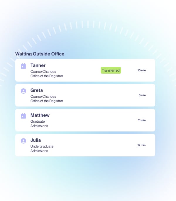
Redesigning the website to be product-driven
The redesigned website was a radical departure from the previous iteration, shifting from a generic, text-heavy layout to a cleaner, more product-forward design. The new visual language helped the website achieve:
Stronger product storytelling with improved hierarchy and visual emphasis on features
llustrations and animations that break down complex product benefits
Development of new UI patterns, clearer information architecture, and optimized CTA placements for better usability and engagement
Improved lead-generation pathways, refining the user journey from homepage to sales contact
The updated brand system has since extended beyond the website into WaitWell’s broader marketing efforts, sales collateral, and, as of this writing, is being adopted into its product interface—ensuring a consistent brand experience.

Customizing an icon library to fit the brand with a gradient effect that echoed the hands in a clock and product visualization that highlighted key information while still preserving the overall branding elements.
WHAT MY COLLEAGUE SAY
I appreciate Trace's organized and analytical mind. She communicates clearly and helps add extra clarity to processes that might otherwise be muddy and unorganized.
Trace is also one of the best people I know who can take a problem and get it "unstuck" (e.g., I think that she singlehandedly saved a client case study video. It would have been a trainwreck without her expertise).
03
Impact to the brand
The branding refinement and website redesign significantly improved WaitWell’s digital presence and sales performance:
30% increase in organic traffic
91% increase in Talk-to-Sales page views, demonstrating stronger engagement with key sales touchpoints
74% lower bounce rate on interactive demos, indicating higher user interest and retention
Beyond the data, user feedback has been overwhelmingly positive. Internally, the team felt a stronger alignment with the brand, while externally, prospective customers experienced a clearer, more compelling product journey that simplified their decision-making process.
Our work on WaitWell’s brand and website has set a new benchmark in the queue management industry. Following the redesign’s success, we observed a shift in how direct competitors present their brands, reinforcing the impact of our strategic direction.

04
What I learned
This project reinforced the value of strategic brand refinement over wholesale reinvention. By making thoughtful, deliberate refinements rather than overhauling the identity, we maintained continuity while vastly improving clarity and impact.
From an execution standpoint, it was a highly collaborative effort. Early concept explorations between myself and two designers, along with the collaborative visual execution, played a significant role in shaping the final product. My role as an art director was both hands-on, getting into the technical details of designing the logo and visual brand elements, and strategic, providing design direction and coaching. This balance allowed me to maintain cohesion in the visual language and structure while making design decisions that directly impacted performance.
It was incredibly rewarding to see the visual brand system we built go beyond the website, shaping the way WaitWell communicates across all its digital and marketing channels. Seeing the measurable impact on lead generation made this a standout project, one that showed how design strategy directly connected with business outcomes.
SHOUTOUTS TO—
Andrew Argue - For the curiosity, for joining me in exploring the possibilities, how far we can push the brand, and for aiming high. For being a wonderful collaborator.
Anna Didenko - For planting the seeds in the initial concept brainstorming phase. Your insights and brilliant conceptual interpretation of the brand's value spurred us to further evolve and land the visual language of WaitWell to where it is today.


