Reducing tech and design debt with a design and illustration system
PRODUCT STRATEGY
CUSTOMER DISCOVERY
UX RESEARCH

0-1
DESIGN & ILLUSTRATION SYSTEM
Improved and built reusable components and cleaned up file structure
2x
FASTER HANDOFFS
Teams could now find and use the right files with less back-and-forth
3+
organized workspaces
Clear workspaces for product, web, and marketing teams

01
—
Core system
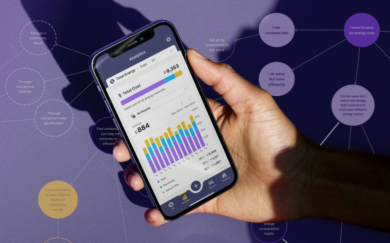
WHEN I JOINED, teams found Jotson’s Figma hard to use.
Files were mixed, names were unclear, and devs didn’t know what was final.
To fix this, I lead the work to:
Create sections for product, web, and marketing
Set up clear naming rules and color-coded covers
Build a dedicated design library with shared components
As a result, the brand now has a single source of truth for design assets. Teams could now find what they needed fast, and designs became more consistent.


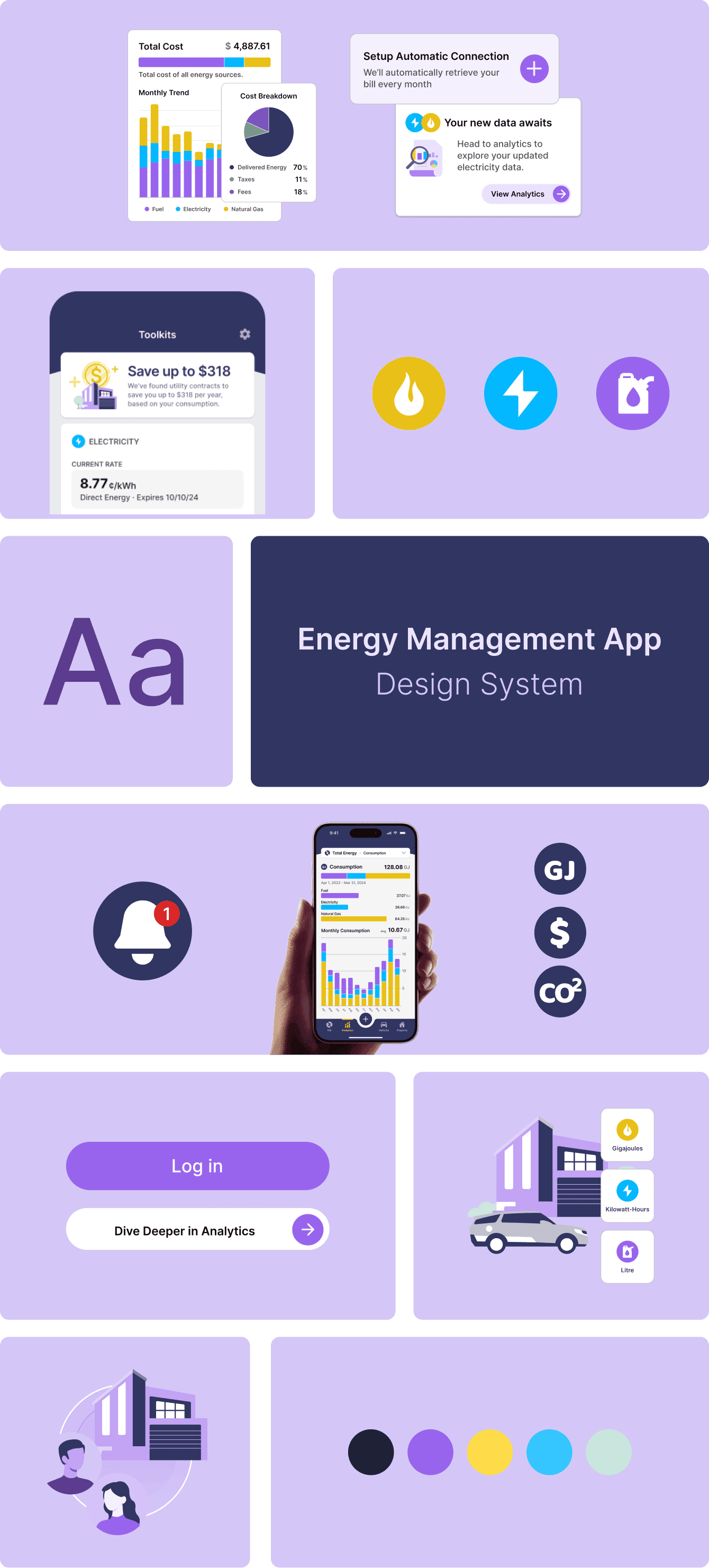
A snapshot of the design library.

Before

AFTER
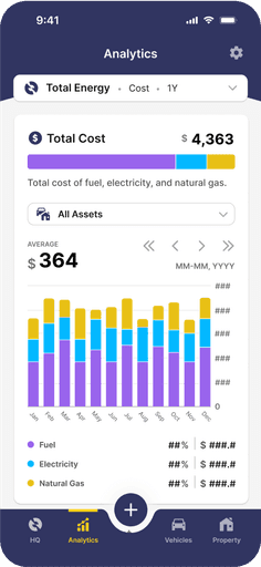
Components were streamlined to be harder working. Here is the main navigation reduced from 10 variants with only one property to 1 component with more functional property settings. This reduced design system maintenance time and improved component usability for the end-user.

Before

AFTER
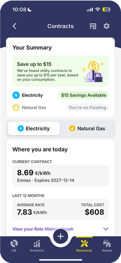
UX improvements on the home screen made with the new system. The design system overhaul also expanded the color palette allowing for a richer and more contextual data visualization experience.

onboarding

hq
analytics
resources
toolkit
Improvements made on the user experience and interface design using the new design system
02
—
Illustration system
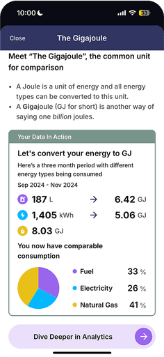
The old illustration style didn’t match the new evolving product. I created a simpler, grown-up version of the old style. The new illustrations are still clean and friendly, but now match the brand's personality.
The illustrations were better at helping explain complex energy topics in a way that was simple, clear, and on-brand. It also now works across product, web, and marketing.

03
—
Key insights & design implications
Issues:
Files were disorganized – teams lost time searching
Design debt was high – devs rebuilt patterns again and again
Style was inconsistent – no shared visual rules
Fixes:
A structured system made work easier for everyone
A single source for design assets saved time for developers
A shared style gave the brand a more unified voice

The new website with the new design system elements applied.
An animated explainer video of the Jotson app. For the video, I made the illustrations and prepared the storyboard on figma. I animated the final edit using After Effects. The sound effects were an extra touch I added to make the video more engaging. The turnaround time for this was very tight and required some late nights but the final video turned out pretty well for which I was quite happy with and so was the brand.
05
—
Impact & measurable outcomes
Short-term impact:
Product and dev teams worked faster
The new designer onboarded smoothly
Visual language is now aligned across product, web, and marketing
Long-term impact:
The design system is still in use and growing
Teams now follow a clear process
Collaboration is faster and more efficient
This project showed how a well-organized system leads to better teamwork, and how small changes can make a big difference.
Want to know more? I’d be happy to walk it through in a chat.
SHOUTOUTS TO—
Saara Niinima - For being an amazing teammate, for design pairing with me and cycling through playing as design system author and design system end-user. We did good
Remus Lacatus - For being an amazing client, manager, and all around good human. For recognizing the role of design and where good design offers value in the product. For holding space for different perspectives and nurturing it to the benefit of the team and to the product.
Curtis Ruetz - For the most understated and best dev feedback design could receive and I quote: "So far no major issues, it’s mostly good. There were some growing pains as everything was in flux. Typography and colors has been pretty consistent." :D