Reducing tech and design debt with a structured design and illustration system
PRODUCT STRATEGY
CUSTOMER DISCOVERY
UX RESEARCH

1k+
APP SUBSCRIBERS
Surpassed the brand’s goal of 1k subscribers by the end of 2024
9x
USABILITY IMPROVEMENTS
Significant improvements to app flow, usability, and new product features
+1
PRODUCT TOOLKIT
Contributed to a new product feature that led to 1k+ new users

01
—
Core system
WHEN I JOINED the project, Jotson was in the early stages of validating its market fit. The CEO and COO had assumptions about their target audience, but had no structured way to test and validate these hypotheses.
To manage expectations, I developed a customer discovery roadmap and presented it in a format that’s already familiar to leadership.
My focus was in discovery and validation. I worked closely with the leads to define who their users are, their problems, and what possible outcomes they seek.

A snapshot of the design library.

Before

AFTER
Components were streamlined to be harder working. Here is the main navigation reduced from 10 variants with only one property to one main component with more functional property settings. This reduced design system maintenance time and improved component usability for the end-user.

Before

AFTER
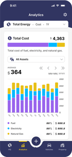
UX improvements on the home screen with a more cohesive system from iconography to core component elements. The design system overhaul also expanded the color palette allowing for a richer and more contextual data visualization experience.

Onboarding

HQ
Analytics
Resources
Toolkit
Improvements made on the user experience and interface design based on research findings
02
—
Illustration system
WHEN I JOINED the project, Jotson was in the early stages of validating its market fit. The CEO and COO had assumptions about their target audience, but had no structured way to test and validate these hypotheses.
To manage expectations, I developed a customer discovery roadmap and presented it in a format that’s already familiar to leadership.
My focus was in discovery and validation. I worked closely with the leads to define who their users are, their problems, and what possible outcomes they seek.

03
—
Key insights & design implications
1. Legibility & data visualization Issues
Older users increased font sizes on their phones, causing data visualizations to break and run off-screen
We addressed the aspect ratios issues and set the font to fixed sizes to preserve readability
While not a perfect fix in terms of accessibility it signals to the team the need for better accessibility as product development progresses
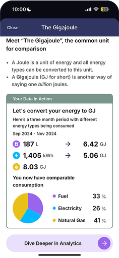
2. Carbon footprint confusion
Users didn’t understand if their carbon footprint score was “good” or “bad”
We introduced benchmarks to provide clearer insights
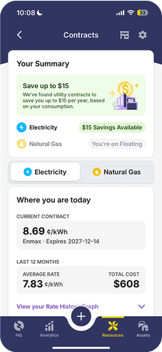
3. Cost savings as the primary driver
Unsurprising, users cared most about how much money they could save
This led to the contract comparison tool, a feature that helped users find the most cost-effective energy plan
The new website and an explainer slide using new design elements and illustrations.

An animated explainer video of the Jotson app. For the video, I created the illustration and prepared the storyboard on figma. I animated the final edit using After Effects. The sound effects were an extra touch I added to make the video more engaging. The turnaround time for this was very tight and required some late nights but the final video turned out pretty well for which I was quite happy with and so was the brand.
05
—
Impact & measurable outcomes
Short-term impact:
The customer discovery roadmap became an ongoing reference for product planning
Prioritized usability fixes improved user experience
Jotson gained clarity on user motivations, leading to the contract comparison tool
Long-term impact:
Surpassed 1,000 subscribers by late 2024, exceeding the brand’s goals
The contract comparison feature became a key growth driver
The COO and product owner continues to refer to the opportunity trees for future product direction
This project reinforced how presenting information in a language already familiar to your decision makers help with getting buy-in.
How a strong, objective framework can help democratize the decision-making. Which helps keep the focus on the project objectives and solution-oriented efforts.
For a deeper dive into the process, I’d be happy to walk it through in a chat.
SHOUTOUTS TO—
Michelle Walstra - For being an amazing copilot! For jumping in to the deep end while the project was already more thank halfway through. For bringing her deep UX insights and enriching our research and making it even more impactful.
Mark Little - For doing the heavy work of being the face of the brand and leading the much needed field work in Canmore and all over Alberta. For supporting the CDR work and recognizing the value user research brings to the product. For being a truly down-to-earth nice guy!
Remus Lacatus - For being an amazing client, manager, and all around good human. For recognizing the role of design and where good design offers value in the product. For holding space for different perspectives and nurturing it to the benefit of the team and to the product.


